
One Key Cards shopping experience
I wrote UX copy & collaborated on design updates to introduce One Key Cards to the credit card shopping experience on the Wells Fargo app.
banking app
UX strategy
content design
UX writing
product comparison
timeline
Overarching project scope: From kickoff to deliverable handoffs


Kickoff (Q3 2023)
Aligned on a deliverable timeline

Status emails
Collaborated with alerts team on updated email templates. Delivered designs & copy decks.

Index pages & form
Requested updates & new index pages for supporting content. Provided feedback on application form page.
App updates (Q1 2024)
Delivered design specs/mockups & copy decks for the new screens and screen updates.
app updates
2 new travel card options
From the Explore tab of the Wells Fargo app, users can select Credit cards to browse the full selection of credit card options, which now include One Key Cards (the regular & + version).
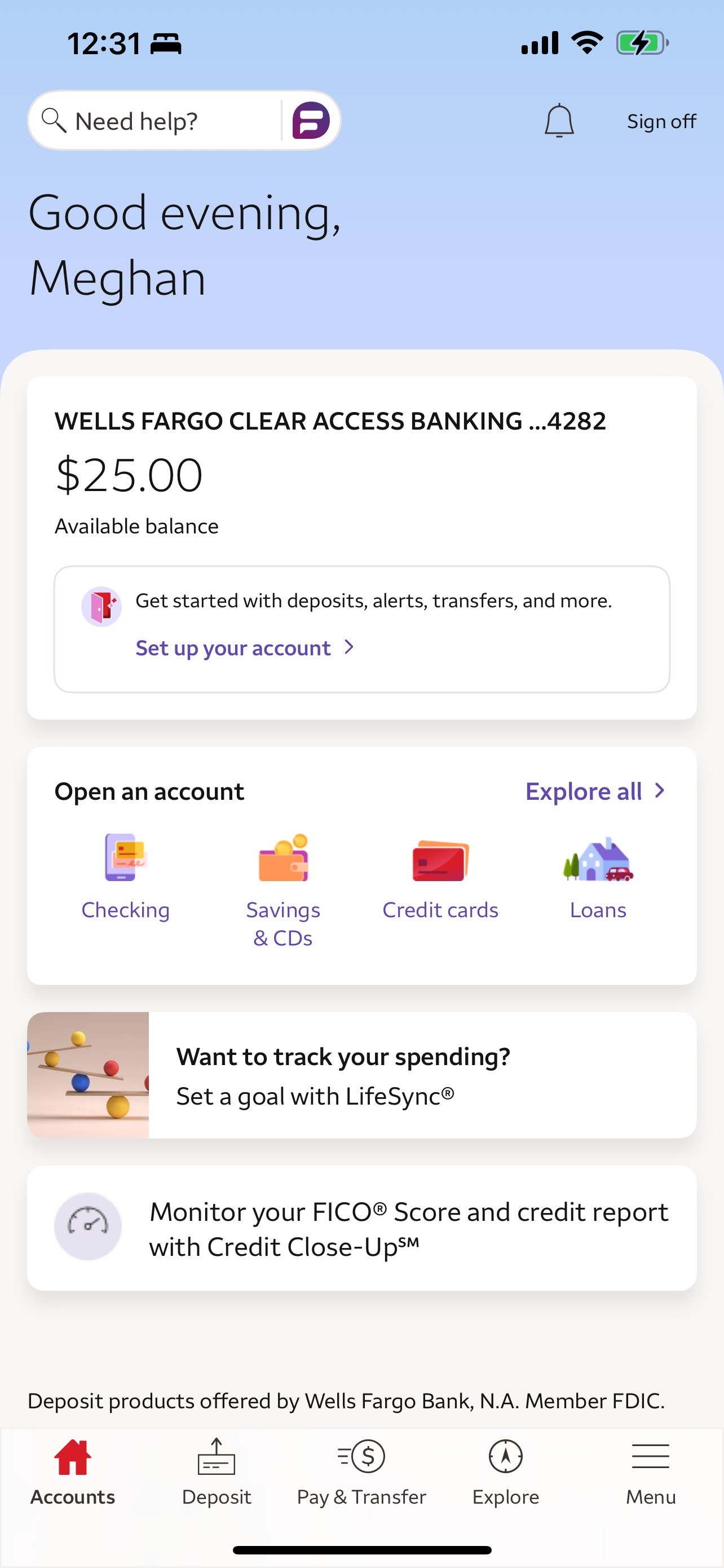
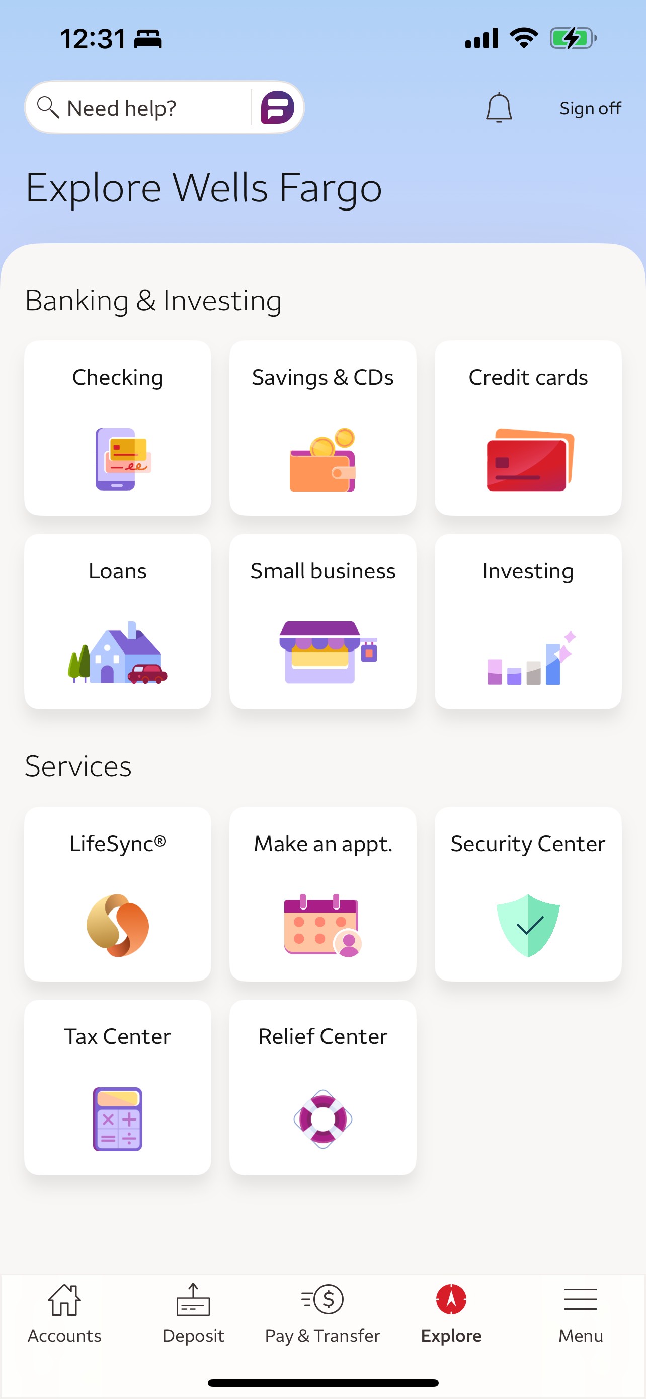
In order to add the new cards to the experience, I collaborated with a product designer to align on UX strategy & mockup the screens in Figma, wrote & documented the content in Word copy decks, and collaborated closely with the marketing team on brand direction & product rewards/benefit descriptions.
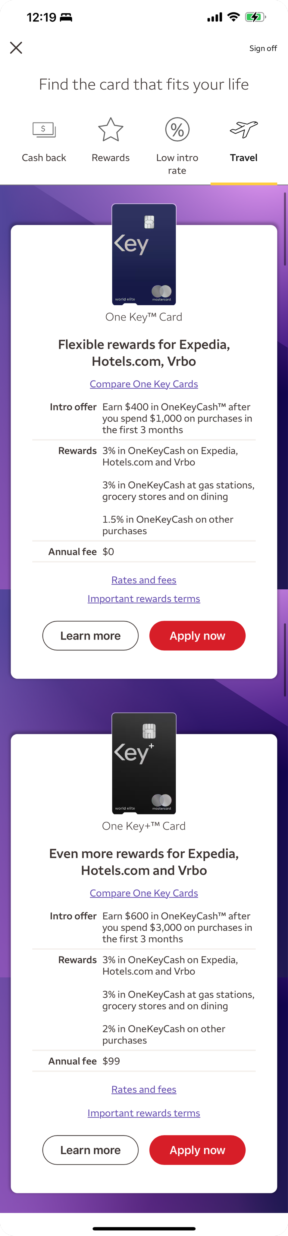
New feature cards on the credit card shopping landing page
The landing page features filter tabs and cards with a basic overview of each card’s core features.

Branding compromise
Partner feedback pushed to have the brand logos featured on the card. Design leadership feedback agreed with our thoughts that it would compete too much with the card info. I counter-proposed listing them in the tagline.
Core value props
I shortened rewards callouts & conferred with marketing & benefits teams to align.

Placement
Added both cards to appear under the️ Rewards & Travel filter tabs.
Compare CTA
Previous compare CTA structure was Compare the [brand] suite of cards, but that language felt lofty, formal, wordy, and encompassing of more than 2 products. I wrote and pitched a simplified CTA to align better with the One Key brand.
All in the details
More details are contained in bottom sheets, allowing users the option to dive deeper into the specifics as desired.
New detail screens for each card
When a user selects the Learn more button, they’re taken to a screen with more details about the credit card.
Cobrand logo compromise
The request from our cobrand partners was to prominently include their brand logos. This was the placement we aligned on.
Explaining the tiered benefits
This value prop is specific to this type of cobrand card. I proposed showcasing it as a featured benefit rather than adding a full chart.
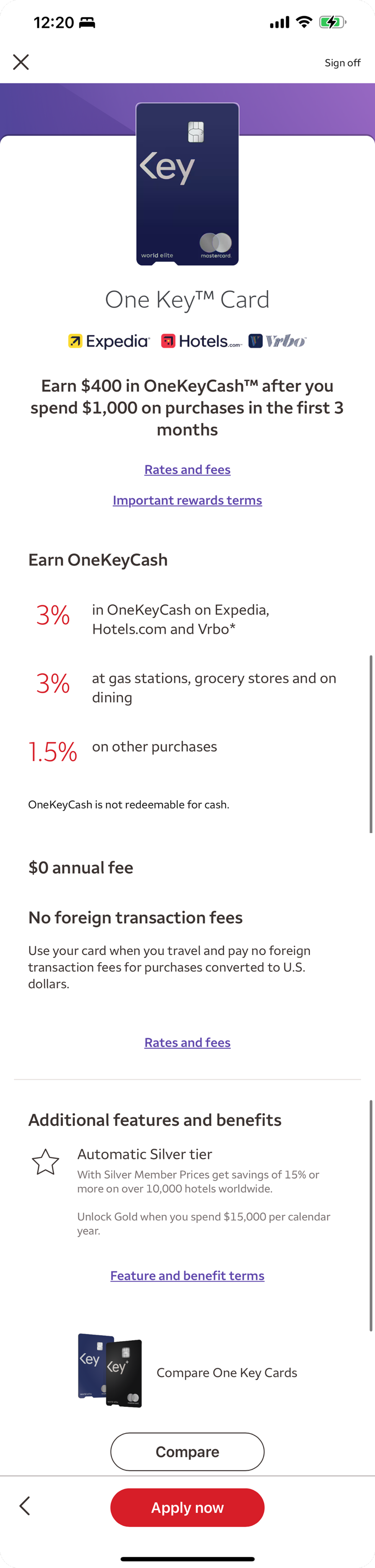
Vertical card art
The UX designer & I both advocated strongly for the use of vertical orientation of the card art in as many places as technically feasible.
Prioritizing information
I proposed the following hierarchy: rewards, fees, & then benefits based on the most common questions users asked in previous research & usability testing.
Compare cards
The UX designer and I were keen to feature a link/button for users to access the comparison page from the individual card details page, so users can more easily access that information.
A sample from the copy deck
Product
One Key (CC-OW)
Content
Image
One Key™ Card
Image
Rates and fees
Important rewards terms
Earn OneKeyCash
Image Up to 9% on Expedia and Hotels.com. 5% on Vrbo*
Attribute
Image= card art, alt text=””
H1, Hidden text= “The new One Key Mastercard”
Image= One Key family of brands logo, alt text=””
Link triggers a half sheet. <link aria-label=“Click here to review rates and fees for the One Key Card. Opens over this page. Close to exit rates and fees and continue.”>
Link triggers a half sheet. <link aria-label=“Click here to review important rewards terms for the One Key Card. Opens over this page. Close to exit important reward terms and continue.”>
H2
Image=9%, alt text= “up to 9% in OneKeyCash”
CMS reference
CCPD14
DNT
One Key™
OneKeyCash
One Key
Expedia
Hotels.com
Vrbo
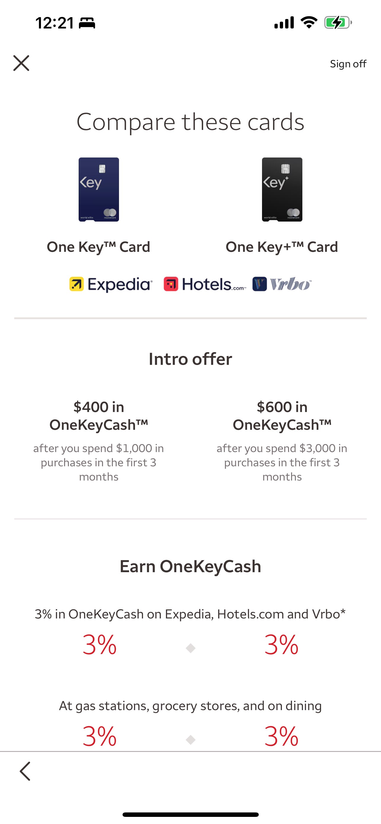
New comparison screen for the One Key Cards
When a user selects the Compare One Key Cards text button on the landing page or the Compare button on the detail screens for one of the One Key Cards, they’re taken to a comparison screen.
Cobrand logo compromise
The request from our cobrand partners was to prominently include their brand logos. This was the placement we aligned on.
Multiple entry points to application
We included 2 button CTAs - mid-screen & towards the bottom, so that users don’t have to return to the landing or details pages.

Side-by-side
This view allows info for both cards to be easily compared. The card names are sticky & remain visible as the user scrolls.
Section breakdowns
I organized the content into separate rewards, fees, & additional benefits sections.
Benefits breakdown
Adding a new section for the tier information wasn’t in scope so I worked it into a prominent spot within the benefits section.
credits
Team & tool acknowledgements
in collaboration with WELLS FARGO
project managed by Eamon Wyse
content design by Meg Morris
product design by MARCOS Sorensen
designed in FIGMA
copy decks created in Microsoft Word


beyond the scope
Learnings & looking ahead
The biggest lesson from this project was defining the different review timelines for cobrand partners & benefits teams. Future scopes will incorporate those into the timelines since those are now on leadership & our PM’s radar.
The designs we created will also serve as templates for future cobrand efforts based on this precedence.
We noted that the tier information would be something good to evaluate user understanding of in future usability testing or research, but that wasn’t in scope for this effort.


Let’s connect


One Key Cards shopping experience
I wrote UX copy & collaborated on design updates to introduce One Key Cards to the credit card shopping experience on the Wells Fargo app.
banking app
UX strategy
content design
UX writing
product comparison
timeline
Overarching project scope: From kickoff to deliverable handoffs

Kickoff (Q3 2023)
Aligned on a deliverable timeline
Status emails
Collaborated with alerts team on updated email templates. Delivered designs & copy decks.
Index pages & form
Requested updates & new index pages for supporting content. Provided feedback on application form page.
App updates (Q1 2024)
Delivered design specs/mockups & copy decks for the new screens and screen updates.
app updates
2 new travel card options
From the Explore tab of the Wells Fargo app, users can select Credit cards to browse the full selection of credit card options, which now include One Key Cards (the regular & + version).
In order to add the new cards to the experience, I collaborated with a product designer to align on UX strategy & mockup the screens in Figma, wrote & documented the content in Word copy decks, and collaborated closely with the marketing team on brand direction & product rewards/benefit descriptions.
New feature cards on the credit card shopping landing page
The landing page features filter tabs and cards with a basic overview of each card’s core features.
Branding compromise
Partner feedback pushed to have the brand logos featured on the card. Design leadership feedback agreed with our thoughts that it would compete too much with the card info. I counter-proposed listing them in the tagline.
Core value props
I shortened rewards callouts & conferred with marketing & benefits teams to align.
Placement
Added both cards to appear under the️ Rewards & Travel filter tabs.
Compare CTA
Previous compare CTA structure was Compare the [brand] suite of cards, but that language felt lofty, formal, wordy, and encompassing of more than 2 products. I wrote and pitched a simplified CTA to align better with the One Key brand.
All in the details
More details are contained in bottom sheets, allowing users the option to dive deeper into the specifics as desired.
New detail screens for each card
When a user selects the Learn more button, they’re taken to a screen with more details about the credit card.
Cobrand logo compromise
The request from our cobrand partners was to prominently include their brand logos. This was the placement we aligned on.
Explaining the tiered benefits
This value prop is specific to this type of cobrand card. I proposed showcasing it as a featured benefit rather than adding a full chart.
Vertical card art
The UX designer & I both advocated strongly for the use of vertical orientation of the card art in as many places as technically feasible.
Prioritizing information
I proposed the following hierarchy: rewards, fees, & then benefits based on the most common questions users asked in previous research & usability testing.
Compare cards
The UX designer and I were keen to feature a link/button for users to access the comparison page from the individual card details page, so users can more easily access that information.
A sample from the copy deck
Product
One Key (CC-OW)
Content
Image
One Key™ Card
Image
Rates and fees
Important rewards terms
Earn OneKeyCash
Image Up to 9% on Expedia and Hotels.com. 5% on Vrbo*
Attribute
Image= card art, alt text=””
H1, Hidden text= “The new One Key Mastercard”
Image= One Key family of brands logo, alt text=””
Link triggers a half sheet. <link aria-label=“Click here to review rates and fees for the One Key Card. Opens over this page. Close to exit rates and fees and continue.”>
Link triggers a half sheet. <link aria-label=“Click here to review important rewards terms for the One Key Card. Opens over this page. Close to exit important reward terms and continue.”>
H2
Image=9%, alt text= “up to 9% in OneKeyCash”
CMS reference
CCPD14
DNT
One Key™
OneKeyCash
One Key
Expedia
Hotels.com
Vrbo
New comparison screen for the One Key Cards
When a user selects the Compare One Key Cards text button on the landing page or the Compare button on the detail screens for one of the One Key Cards, they’re taken to a comparison screen.
Cobrand logo compromise
The request from our cobrand partners was to prominently include their brand logos. This was the placement we aligned on.
Multiple entry points to application
We included 2 button CTAs - mid-screen & towards the bottom, so that users don’t have to return to the landing or details pages.
Side-by-side
This view allows info for both cards to be easily compared. The card names are sticky & remain visible as the user scrolls.
Section breakdowns
I organized the content into separate rewards, fees, & additional benefits sections.
Benefits breakdown
Adding a new section for the tier information wasn’t in scope so I worked it into a prominent spot within the benefits section.
credits
Team & tool acknowledgements
in collaboration with WELLS FARGO
project managed by Eamon Wyse
content design by Meg Morris
product design by MARCOS Sorensen
designed in FIGMA
copy decks created in Microsoft Word
beyond the scope
Learnings & looking ahead
The biggest lesson from this project was defining the different review timelines for cobrand partners & benefits teams. Future scopes will incorporate those into the timelines since those are now on leadership & our PM’s radar.
The designs we created will also serve as templates for future cobrand efforts based on this precedence.
We noted that the tier information would be something good to evaluate user understanding of in future usability testing or research, but that wasn’t in scope for this effort.
Let’s connect

One Key Cards shopping experience
I wrote UX copy & collaborated on design updates to introduce One Key Cards to the credit card shopping experience on the Wells Fargo app.
banking app
UX strategy
content design
UX writing
product comparison
timeline
Overarching project scope: From kickoff to deliverable handoffs

Kickoff (Q3 2023)
Aligned on a deliverable timeline
Status emails
Collaborated with alerts team on updated email templates. Delivered designs & copy decks.
Index pages & form
Requested updates & new index pages for supporting content. Provided feedback on application form page.
App updates (Q1 2024)
Delivered design specs/mockups & copy decks for the new screens and screen updates.
app updates
2 new travel card options
From the Explore tab of the Wells Fargo app, users can select Credit cards to browse the full selection of credit card options, which now include One Key Cards (the regular & + version).
In order to add the new cards to the experience, I collaborated with a product designer to align on UX strategy & mockup the screens in Figma, wrote & documented the content in Word copy decks, and collaborated closely with the marketing team on brand direction & product rewards/benefit descriptions.
New feature cards on the credit card shopping landing page
The landing page features filter tabs and cards with a basic overview of each card’s core features.
Branding compromise
Partner feedback pushed to have the brand logos featured on the card. Design leadership feedback agreed with our thoughts that it would compete too much with the card info. I counter-proposed listing them in the tagline.
Core value props
I shortened rewards callouts & conferred with marketing & benefits teams to align.
Placement
Added both cards to appear under the️ Rewards & Travel filter tabs.
Compare CTA
Previous compare CTA structure was Compare the [brand] suite of cards, but that language felt lofty, formal, wordy, and encompassing of more than 2 products. I wrote and pitched a simplified CTA to align better with the One Key brand.
All in the details
More details are contained in bottom sheets, allowing users the option to dive deeper into the specifics as desired.
New detail screens for each card
When a user selects the Learn more button, they’re taken to a screen with more details about the credit card.
Cobrand logo compromise
The request from our cobrand partners was to prominently include their brand logos. This was the placement we aligned on.
Explaining the tiered benefits
This value prop is specific to this type of cobrand card. I proposed showcasing it as a featured benefit rather than adding a full chart.
Vertical card art
The UX designer & I both advocated strongly for the use of vertical orientation of the card art in as many places as technically feasible.
Prioritizing information
I proposed the following hierarchy: rewards, fees, & then benefits based on the most common questions users asked in previous research & usability testing.
Compare cards
The UX designer and I were keen to feature a link/button for users to access the comparison page from the individual card details page, so users can more easily access that information.
A sample from the copy deck
Product
One Key (CC-OW)
Content
Image
One Key™ Card
Image
Rates and fees
Important rewards terms
Earn OneKeyCash
Image Up to 9% on Expedia and Hotels.com. 5% on Vrbo*
Attribute
Image= card art, alt text=””
H1, Hidden text= “The new One Key Mastercard”
Image= One Key family of brands logo, alt text=””
Link triggers a half sheet. <link aria-label=“Click here to review rates and fees for the One Key Card. Opens over this page. Close to exit rates and fees and continue.”>
Link triggers a half sheet. <link aria-label=“Click here to review important rewards terms for the One Key Card. Opens over this page. Close to exit important reward terms and continue.”>
H2
Image=9%, alt text= “up to 9% in OneKeyCash”
CMS reference
CCPD14
DNT
One Key™
OneKeyCash
One Key
Expedia
Hotels.com
Vrbo
New comparison screen for the One Key Cards
When a user selects the Compare One Key Cards text button on the landing page or the Compare button on the detail screens for one of the One Key Cards, they’re taken to a comparison screen.
Cobrand logo compromise
The request from our cobrand partners was to prominently include their brand logos. This was the placement we aligned on.
Multiple entry points to application
We included 2 button CTAs - mid-screen & towards the bottom, so that users don’t have to return to the landing or details pages.
Side-by-side
This view allows info for both cards to be easily compared. The card names are sticky & remain visible as the user scrolls.
Section breakdowns
I organized the content into separate rewards, fees, & additional benefits sections.
Benefits breakdown
Adding a new section for the tier information wasn’t in scope so I worked it into a prominent spot within the benefits section.
credits
Team & tool acknowledgements
in collaboration with WELLS FARGO
project managed by Eamon Wyse
content design by Meg Morris
product design by MARCOS Sorensen
designed in FIGMA
copy decks created in Microsoft Word
beyond the scope
Learnings & looking ahead
The biggest lesson from this project was defining the different review timelines for cobrand partners & benefits teams. Future scopes will incorporate those into the timelines since those are now on leadership & our PM’s radar.
The designs we created will also serve as templates for future cobrand efforts based on this precedence.
We noted that the tier information would be something good to evaluate user understanding of in future usability testing or research, but that wasn’t in scope for this effort.
Let’s connect