
5500 filing flow for 401(k) plan sponsors
I collaborated on a navigable UI strategy & wrote UX copy to guide users through filing their 5500 online.
strategy
strategy
dynamic content
UX writing
error messages
help content
challenge
Moving to single sign-on
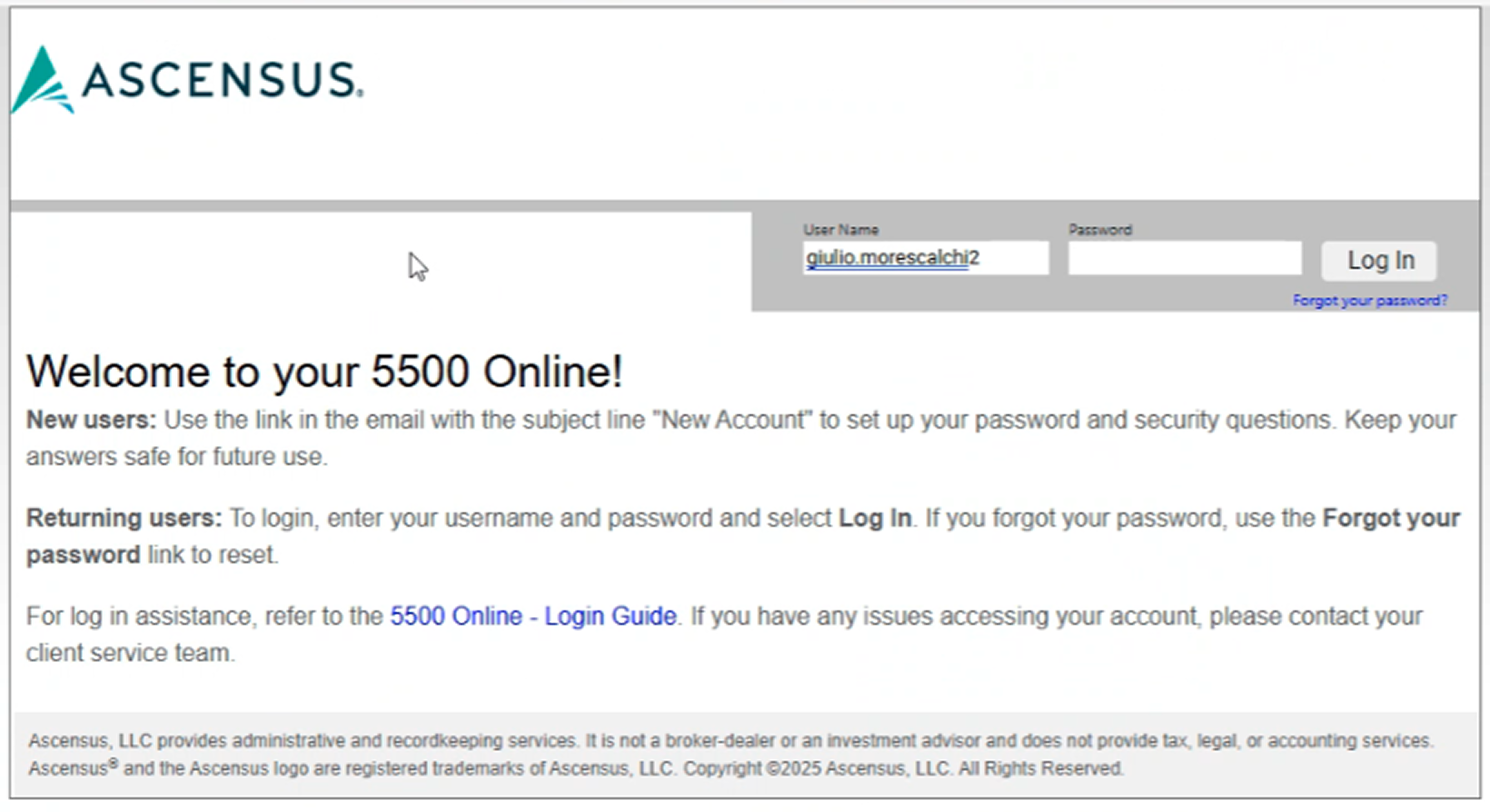
The previous filing software (Relius) required management of a username & password. This was a struggle for plan sponsors to remember since they only need it once a year.
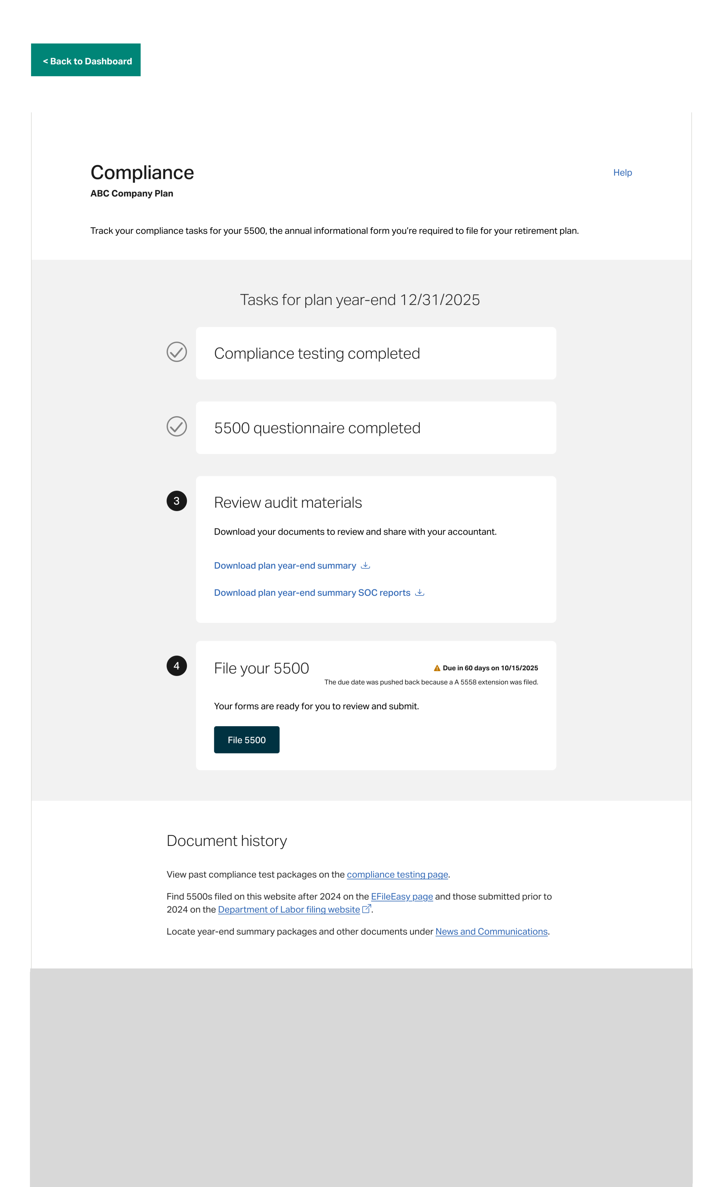
The proposed solution was to create a new filing experience that could be accessed through single sign-on from the plan sponsor website & tie in with the new compliance landing page.
before & after
From instructions-required headache to straightforward, intuitive steps
I collaborated with the UX designer & developer on a new vision for the filing flow. Since it was all new, we were able to make some changes to improve the user experience as well, removing the dense blocks of text in favor of clear, actionable steps & a defined content heirarchy.
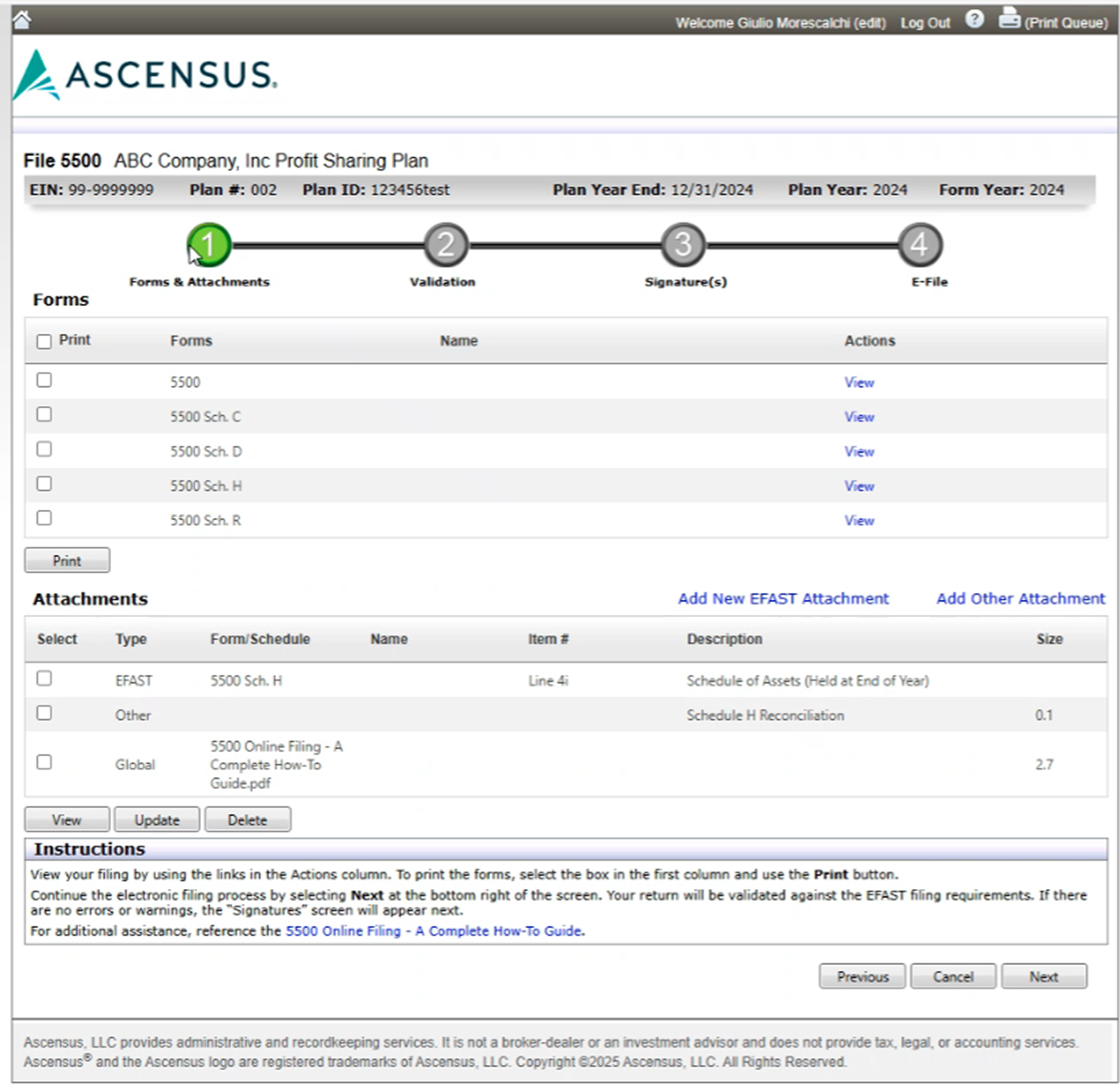
Before: Relius filing
The old UI featured dense block of text, multipe/confusing
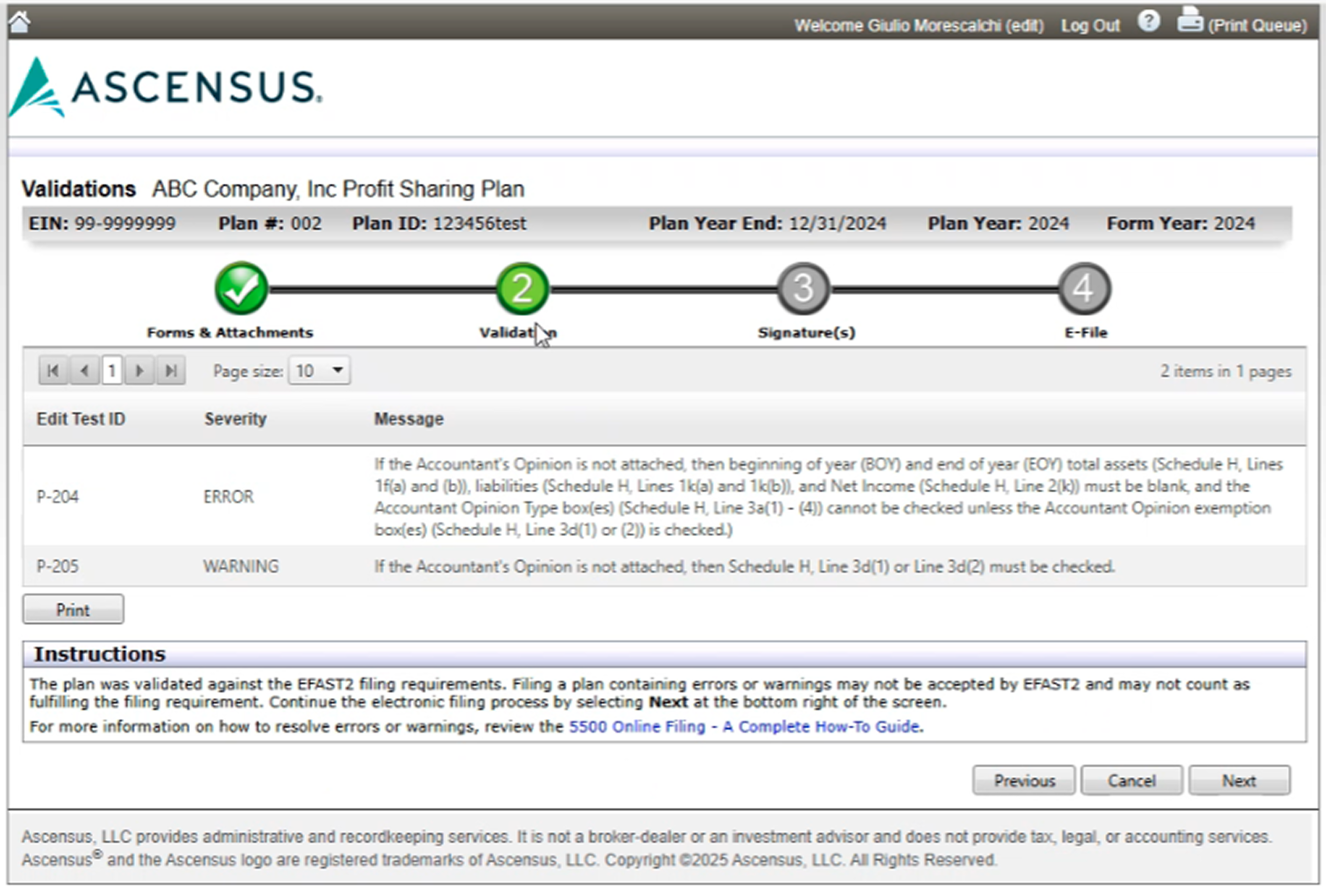
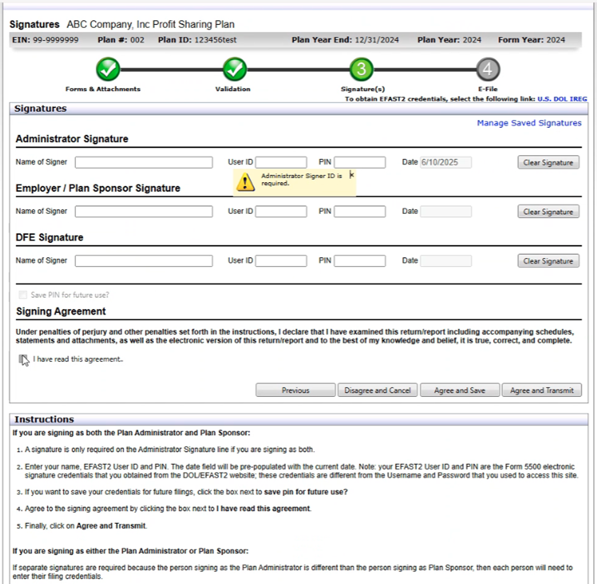
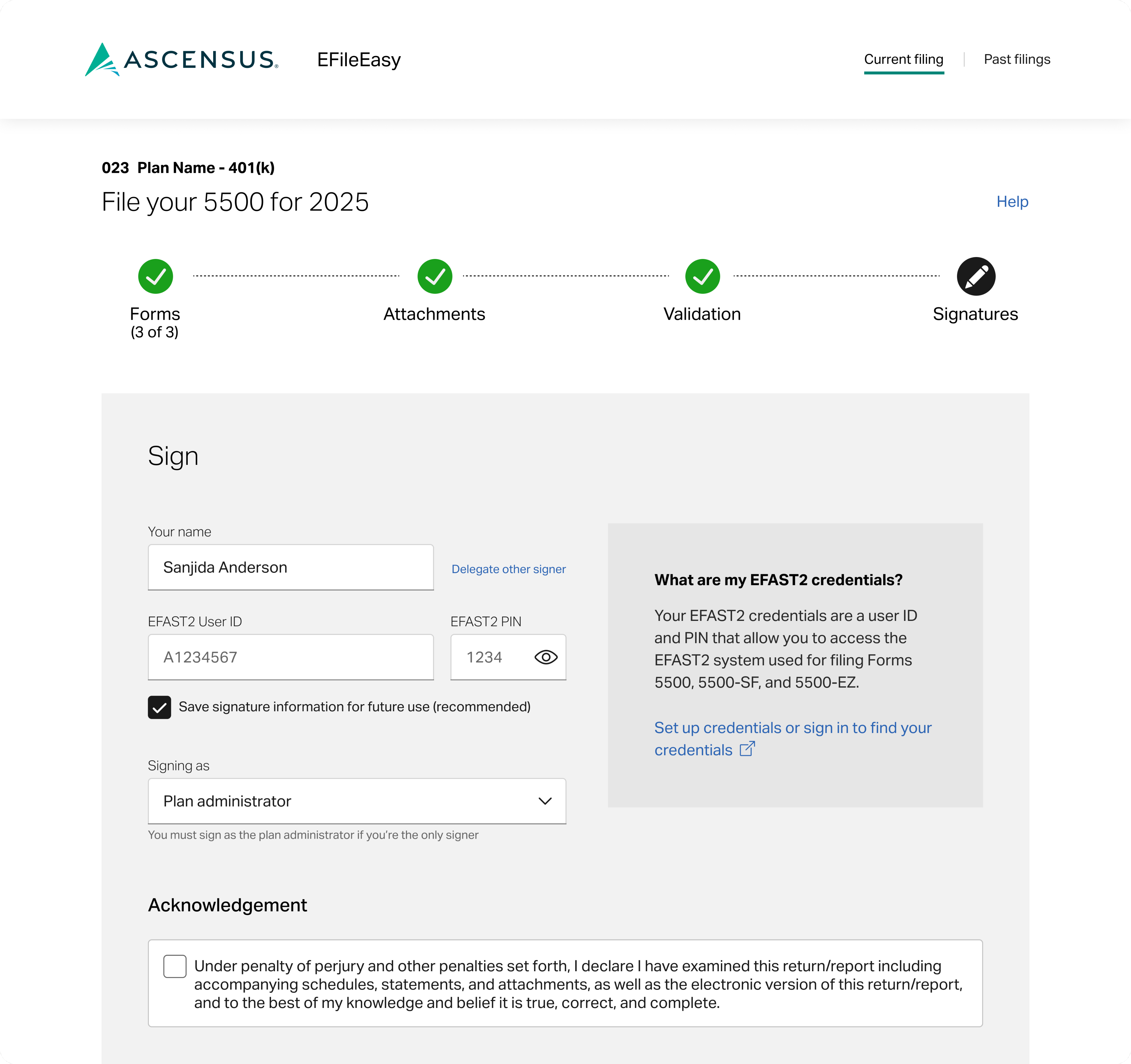
After: EFileEasy
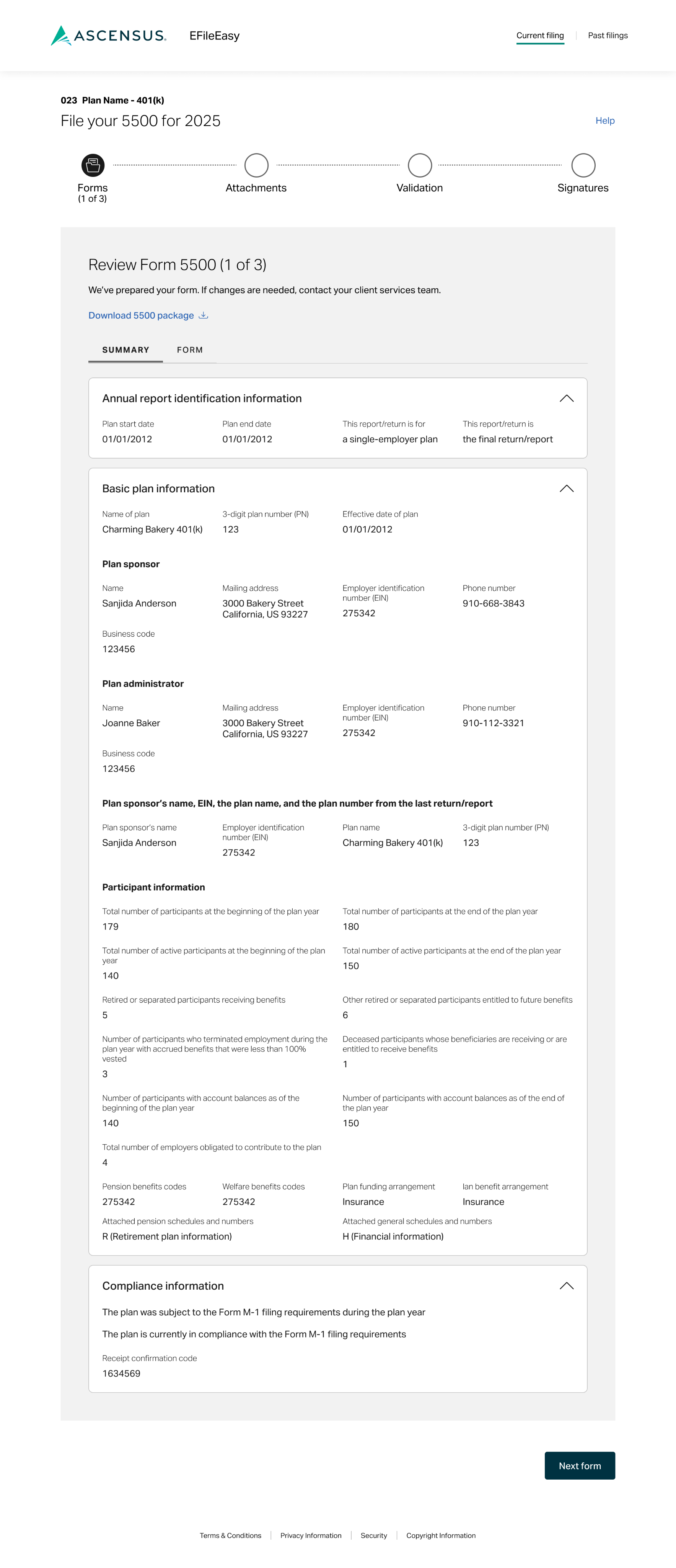
We opted for a more minimalist approach with clear calls to action to guide users through the experience.
Some key overarching updates I advocated for that made it to the final launch:
- Less text to read which is less of a cognitive load on users, making it easier for them to focus on each action.
- Removing the e-file step & in favor of having sign/submit be the final step (requiring action & in the progress bar) & having a separate confirmation screen (not shown in the progress bar, because there’s no more progress to complete).
- Patterns for labels, headers, & button CTA text
flow
A step-by-step experience that adopts to plan type & signature choices
We thought through how the experience would change depending on if the user had a small or large ERISA plan, whether it was a plan type that required additional attachments, or if the user wanted to delegate signing or add an additional signer.
There was also a need to create a unique experience for large plans with 3(16) services since they would need to download documents for their audit & upload their accountant’s opinion (but we would still file for them).
forms
Toggle between summary & form view to review information
Users will be prompted to review each prefilled form for their plan. The summary view is selected by default, but they can toggle to the form view to see all of the form fields. Sadly, form edit capabiliteis weren’t

Headers
I styled the headers (H2) as calls to action to guide the user on what action was needed at each step.

Step labels
I had drafted more specific language to accomodate
Summary
The introduction of a summary view meant we needed content to summarize what was documented in the form. I crafted messaging for every possible election.
A sample from the copy deck
H2: Review Form 5500
We’ve prepared your form. If changes are needed, contact your client services team.
Text button: Download 5500 package {download icon}
Tab 1: Summary
Tab 2: Form
H3: Annual report identification information
Label: Plan start date
[MM/DD/YYYY]
Label: Plan end date
[MM/DD/YYYY]
Label: This return/report is for
a multiemployer plan or a single-employer plan or a multiple employer plan or a DFE
Label: This return/report is
the first return/report or the final return/report or an amended return/report or a short plan return/report (less than 12 months)
Label: Filing under
Form 5558 or automatic extension or DFVC program or special extension
This is a retroactively adopted plan permitted by SECURE Act section 201
attachments
Dynamic content for adding required attachments
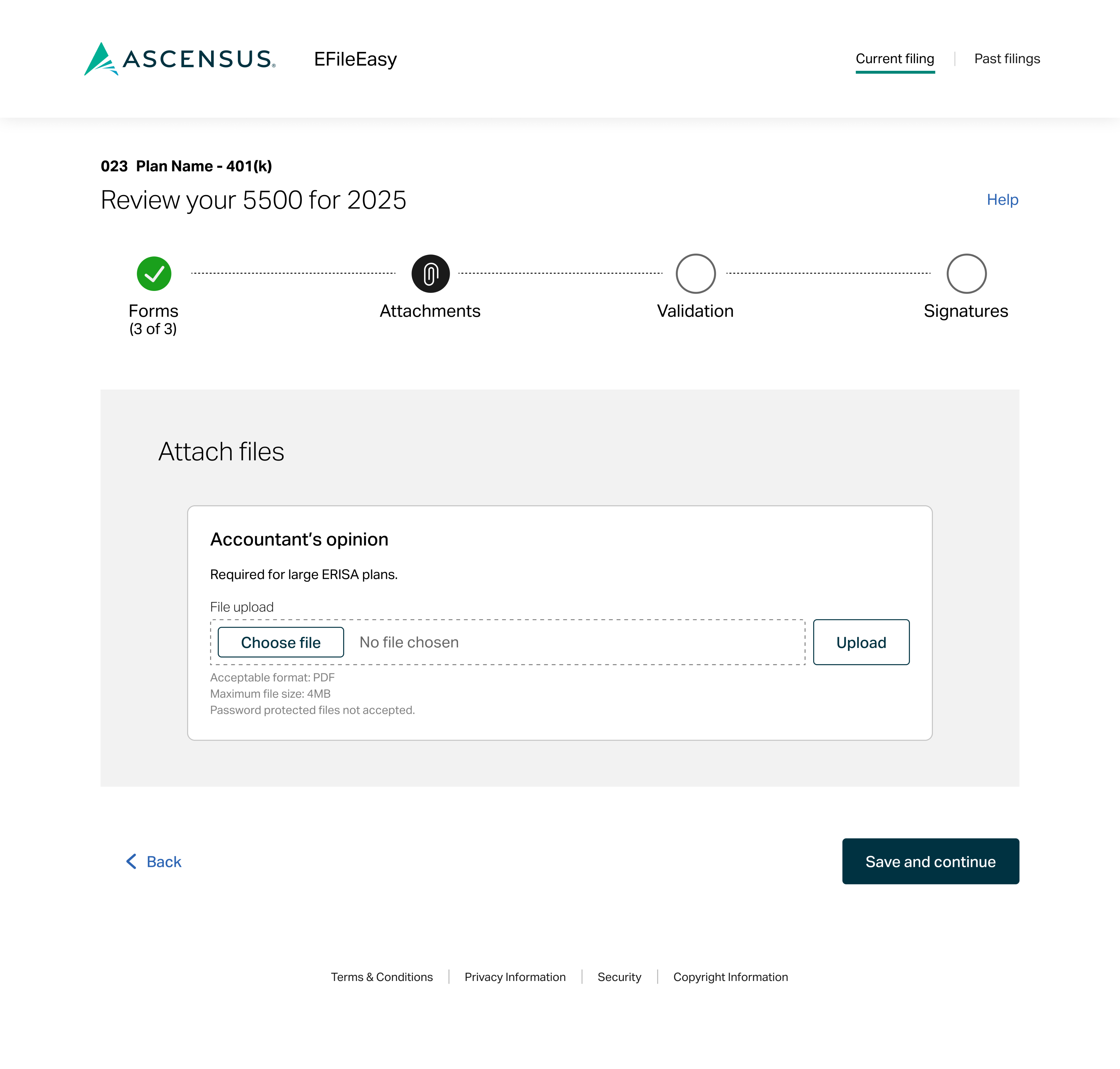
If the user has a large plan, they’re prompted to attach any required files.
Attach files
I provided content for all of the potential attachments that users could need to upload, so we can dynamically showcase the specific files needed for each users’ plan.
Upload button
The addition of an upload button/step was pushed for by the UX design team to prevent users from losing upload progress if they lost connection or power, etc. I admitadly have concerns about the extra clicks & the potential for
A sample from the copy deck
H2: Attach files
H3: Accountant’s opinion
Body copy: Required for large ERISA plans
Form field label: File upload
Button: Choose file
Button: Upload
Error text: The file is password protected. Remove password protection from the file and upload.
Helper text:
Acceptable format: PDF
Maximum file size: 4MB
Password protected files not accepted.
validation
Reassurance or chance to review issues
The previous filing software (Relius) required the management of a username & password. This was a struggle for plan sponsors to remember since they only need it once a year.
Extra step
We decided to include this step based on user feedback, but the UX designer & I both expressed concerned & curiousity about
Review issues
Error messages tied to potential issues with the forms will appear here. Users will have to contact service for help to address them. We pitched a future state update to allow for them to request or make updates, but that wasn’t in scope for launch.
A sample from the copy deck
H2: Review issues
{✓ icon}
No issues found
OR
{⚠️ icon}
[#] issues found
Review and contact your client services team if you need help.
[error messages]
Text button: Download 5500 package {download icon}
{<icon} Text button: Back
Button: Continue
signatures
Sign with EFAST2 credentials
Users are prompted to sign with thier
Clear, conversational field labels
I used “you” & “your” to refer to the filer/signer to make it feel more conversational & also makes things clear (i.e., “your name” vs. “sponsor name” since some signers may not identify with that role)
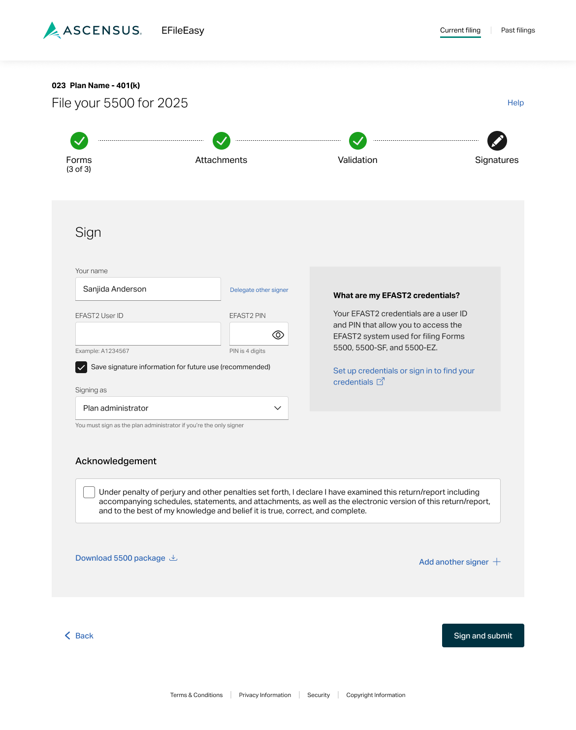
Explaining credentials
I wanted to give users context around what these credentials are & where they can set up or locate them if needed since past feedback indicated users struggle to identify & understand the need for additional credentials.
2nd signer info
Selecting the Add another signer + text button, prompts some additional form fields.
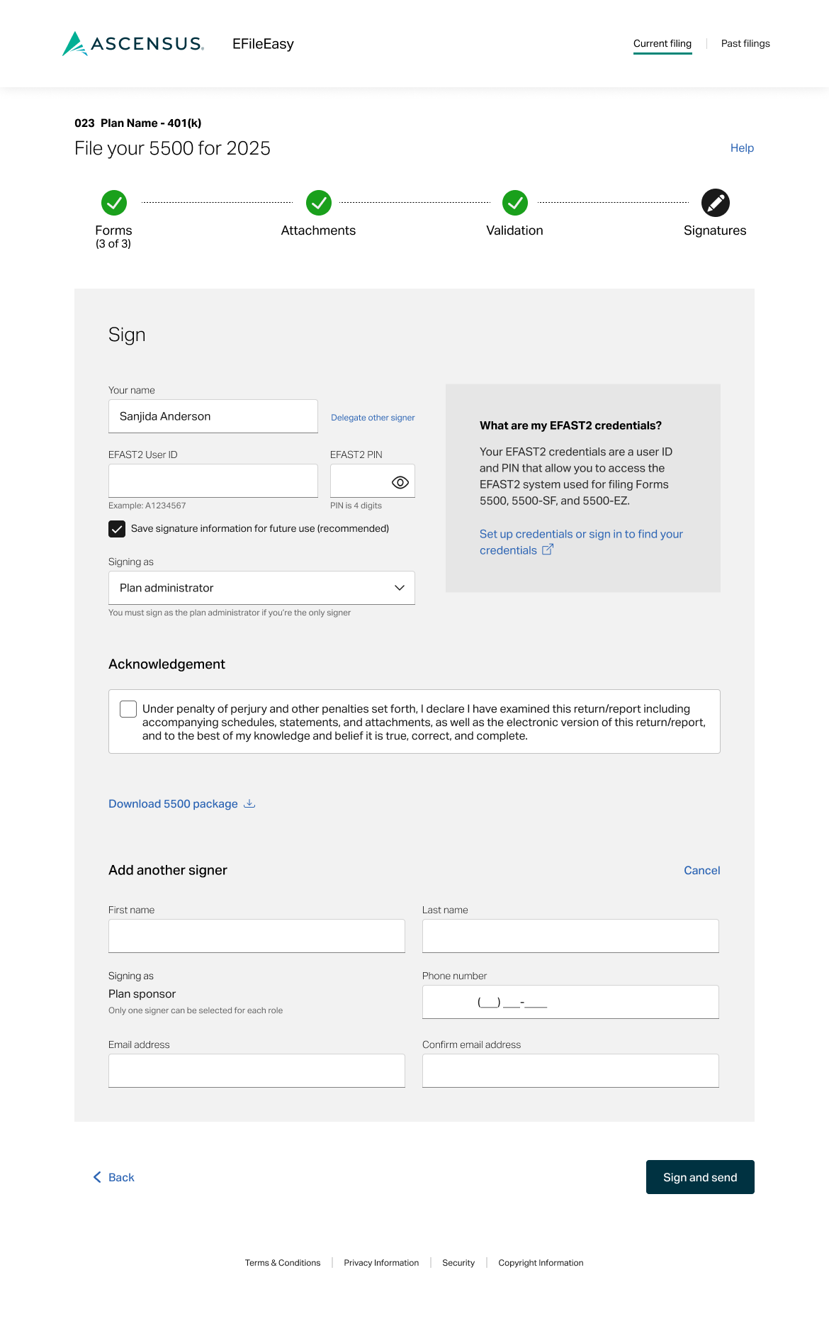
Button CTA language
When the user opts to add a 2nd signer, the CTA changes to “send” instead of “submit.” The forms aren’t “submitted” to the IRS/DOL until the other signature is added.
A sample from the copy deck
H2: Sign
Form field label: Your name
Text button: Delegate other signer
Form field label: EFAST2 user ID
Helper text: TBD
Form field label: EFAST2 PIN
Helper text: TBD
{checkbox} Save signature information for future use (recommended)
Form field label: Signing as
Helper text: You must sign as the plan administrator if you’re the only signer.
H3: What are my EFAST2 credentials?
Your EFAST2 credentials are a user ID and PIN that allow you to access the EFAST2 system used for filing Forms 5500, 5500-SF, and 5500-EZ.
Text button: Set up credentials or sign in to find your credentials {external link icon}?
H3: Acknowledgement
{checkbox} Under penalty of perjury and other penalties set forth, I declare I have examined this return/report including accompanying schedules, statements, and attachments, as well as the electronic version of this return/report, and the best of my knowledge and belief it is true, correct, and complete.
Text button: Download 5500 package {download icon}
Text button: Add another signer +
confirmation
A celebration with important details
I pitched the idea of having a confirmation page that was seperate from teh
A bit of joy
We included a celebratory illustration to mark the finish line.
Downloads
We styled the downloads as buttons to give them a bit of weight to draw more attention in case users need or want to save them for their records.
Print confirmation
We styled the print option as a text button so it wouldn’t compete too much with the file downloads. Users will also recieve an email confirmation & be able to reference this page from the compliance landing page
A sample from the copy deck
Text button: Print {🖨️ icon}
{illustration}
H2: Your files have been submitted
H3: Your 5500 has been submitted to the Department of Labor (DOL)
The DOL has received your documents and provided the following confirmation information:
Acknowledgement ID: [#]
Intake date: [date]
H3: Your 8955-SSA has been submitted to the Internal Revenue Service (IRS)
The IRS has received your documents and provided the following confirmation information:
Intake date: [date]
H3: Your 5500 has been submitted to the Department of Labor (DOL)
The DOL has recieved your documents and provided the following confirmation information:
Acknowledgement ID: [#]
Intake date: [date]
Button: Download 5500 package {download icon}
Delegate signer & additional signer added confirmations
I wrote custom confirmation messaging for users who delegated signing or added a 2nd signer. The text for buttons on the cancel confirmation was a little tricky because I didn’t want to use “cancel” to indicate canceling out of an attempt to cancel something. I feel like the question header couples nicely with the “yes” and “no” options plus the brief action statement adds addtional clarity.
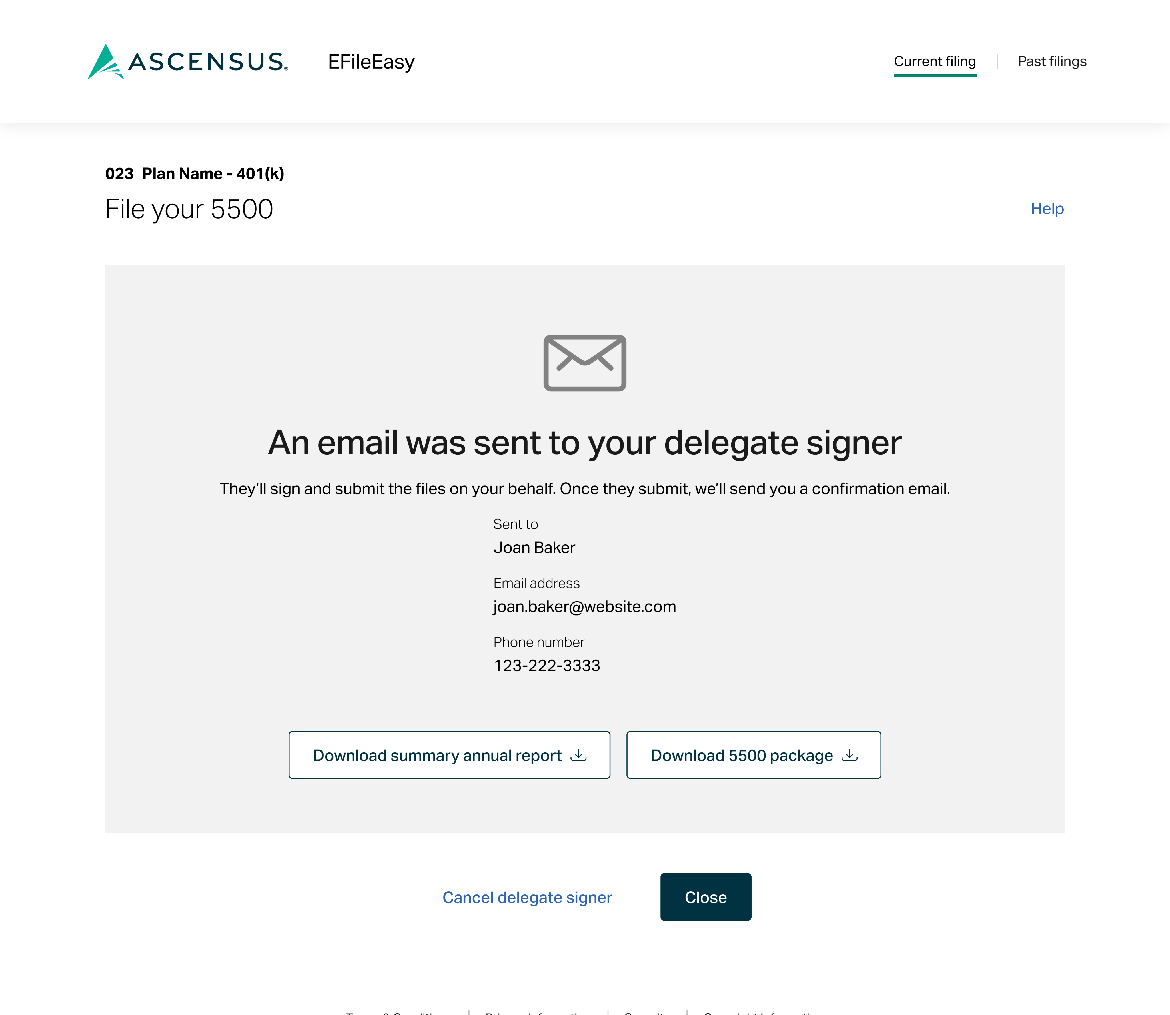
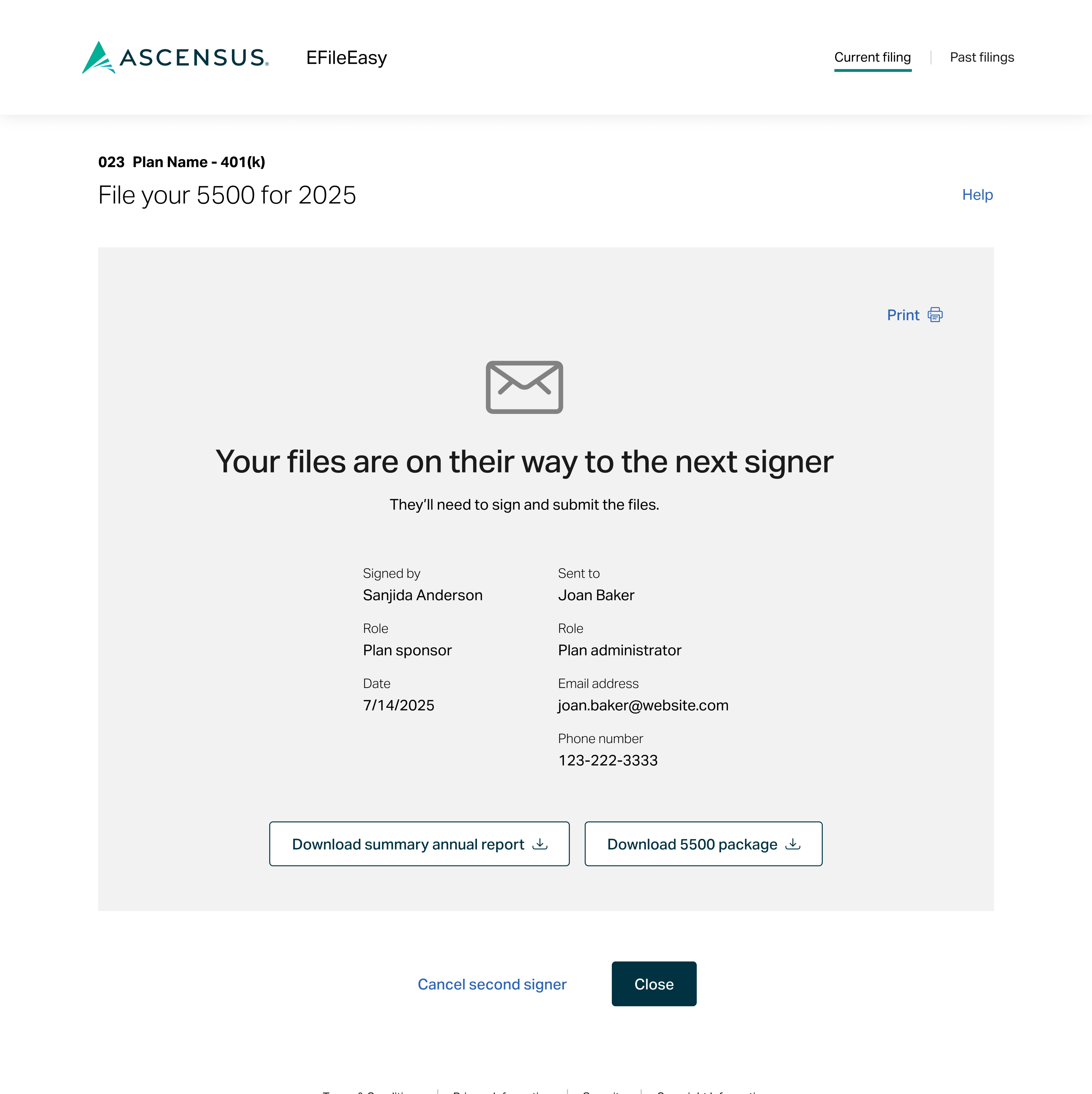
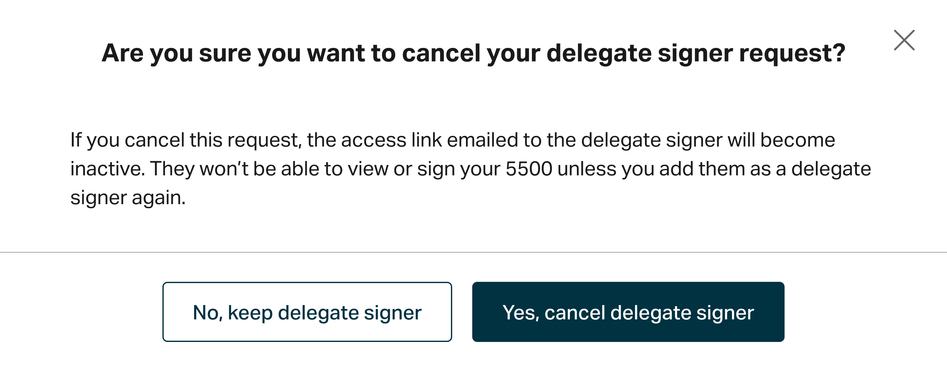
The text for buttons on the cancel confirmations was a little tricky because I didn’t want to use “cancel” to indicate canceling out of an attempt to cancel something. I feel like the question header couples nicely with the “yes” and “no” options plus the brief action statement adds additional clarity.
user guide
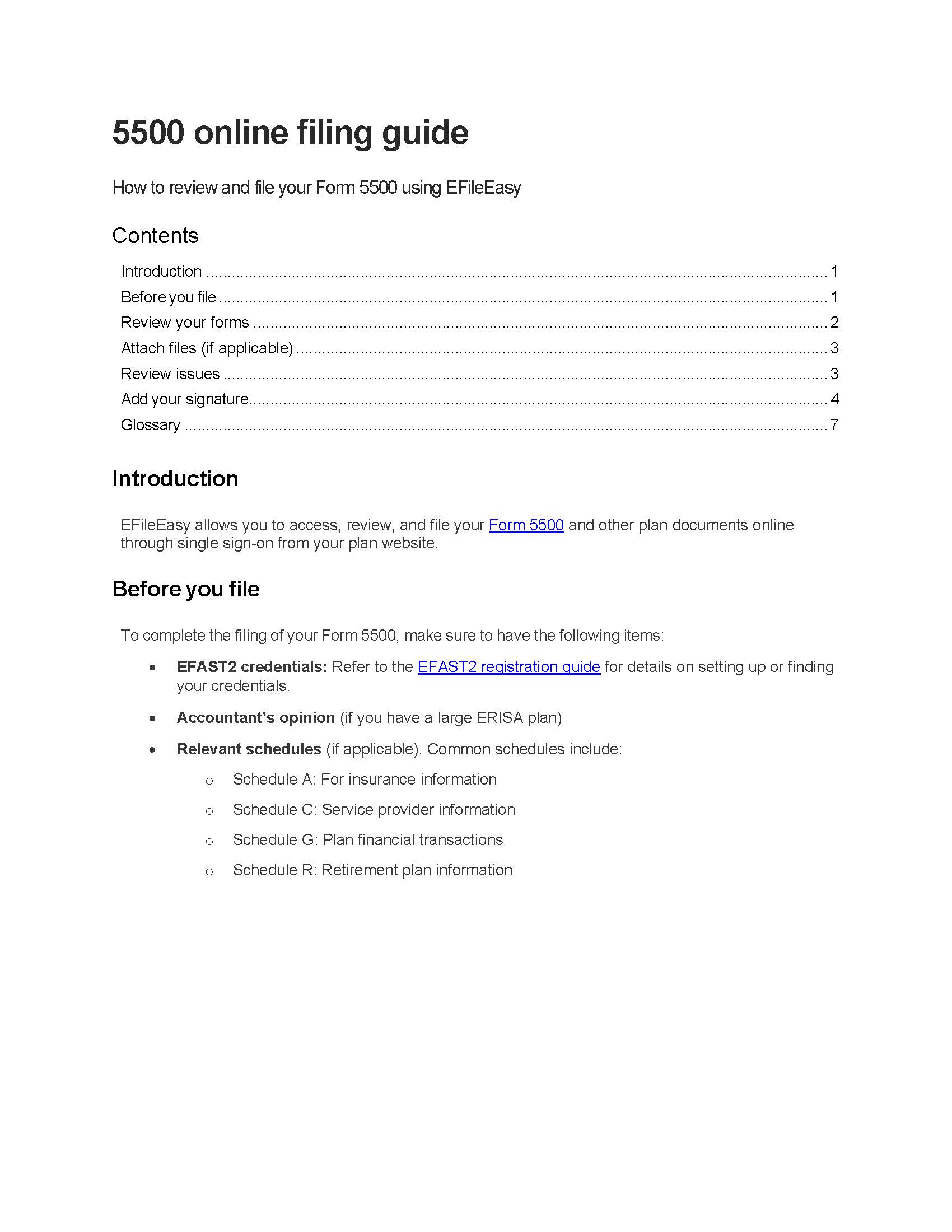
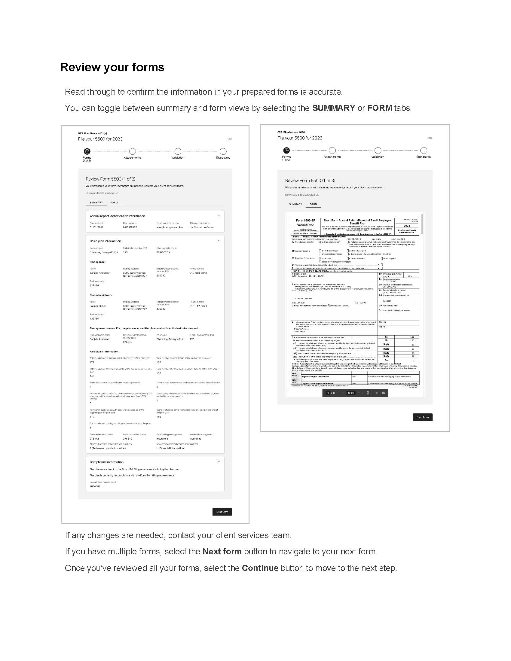
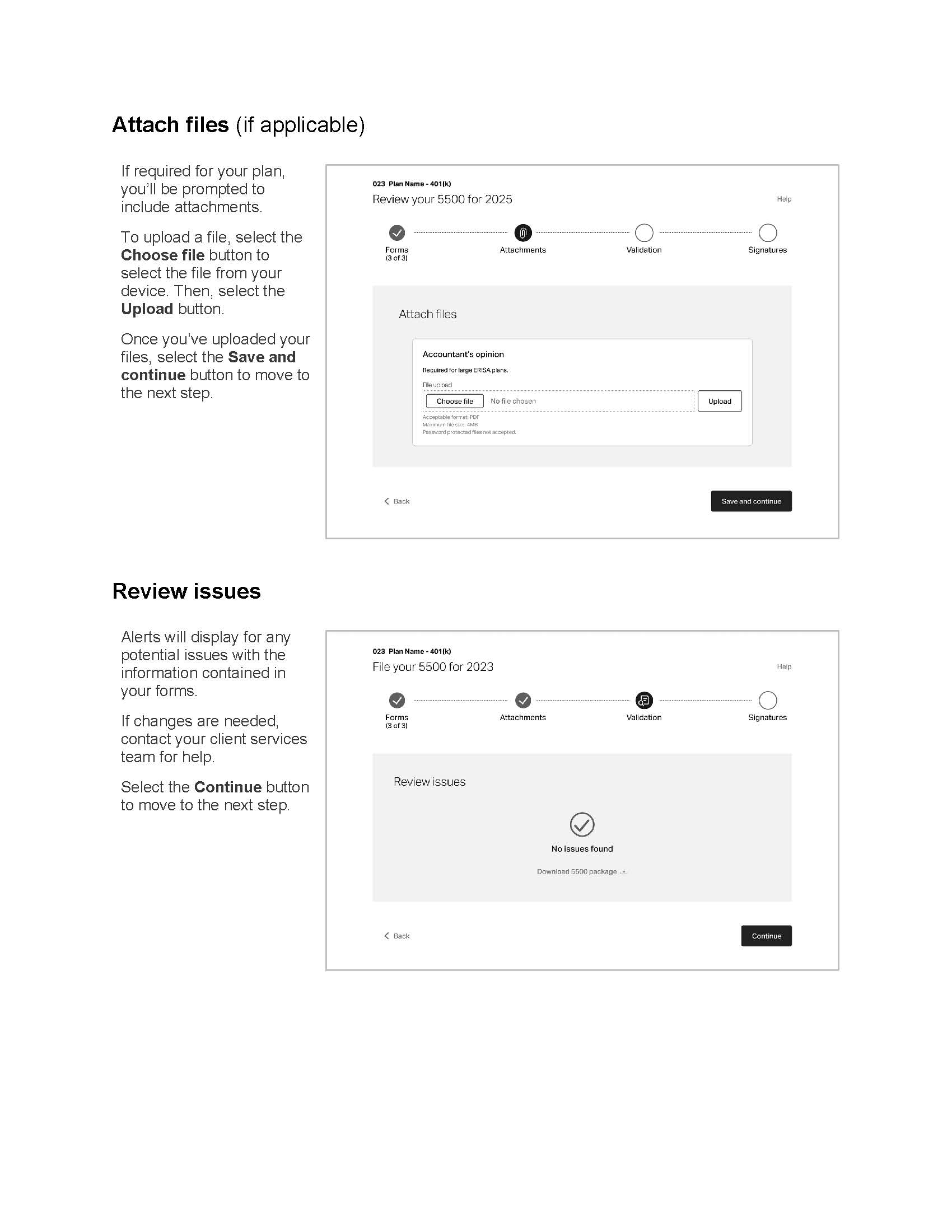
A guide to online filing
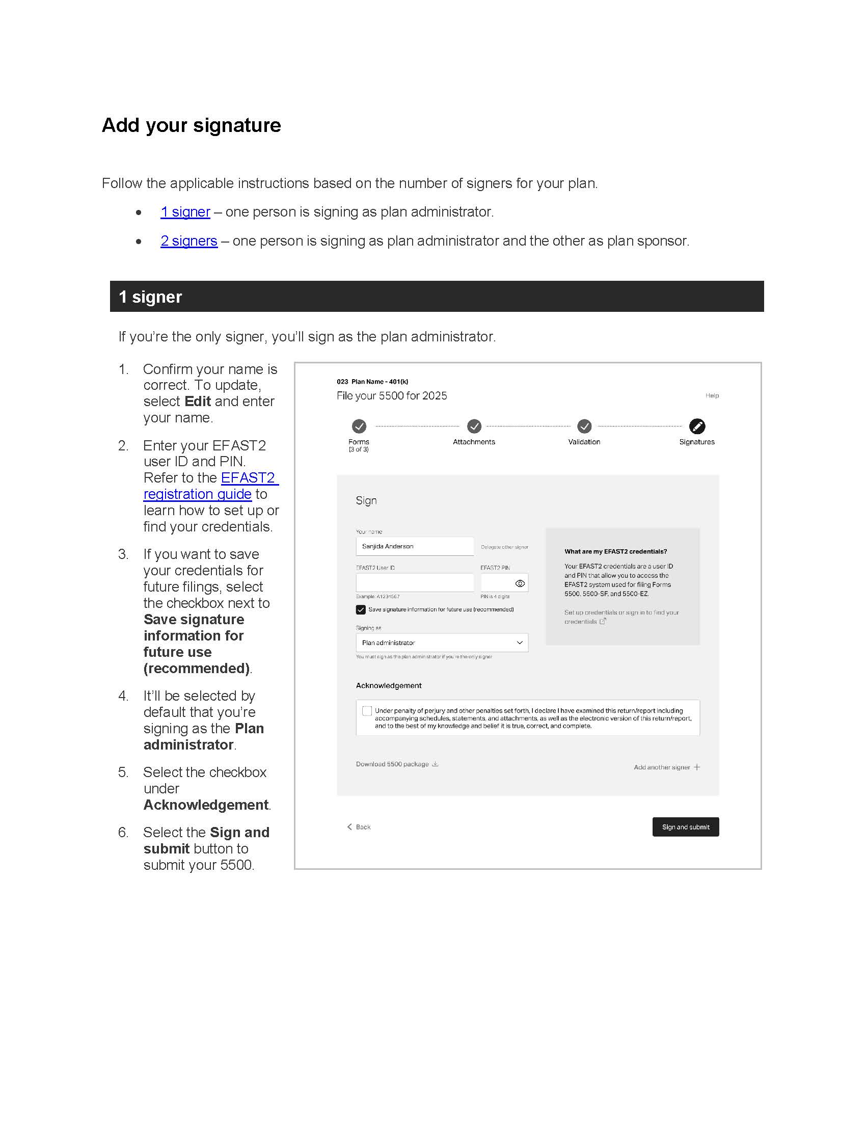
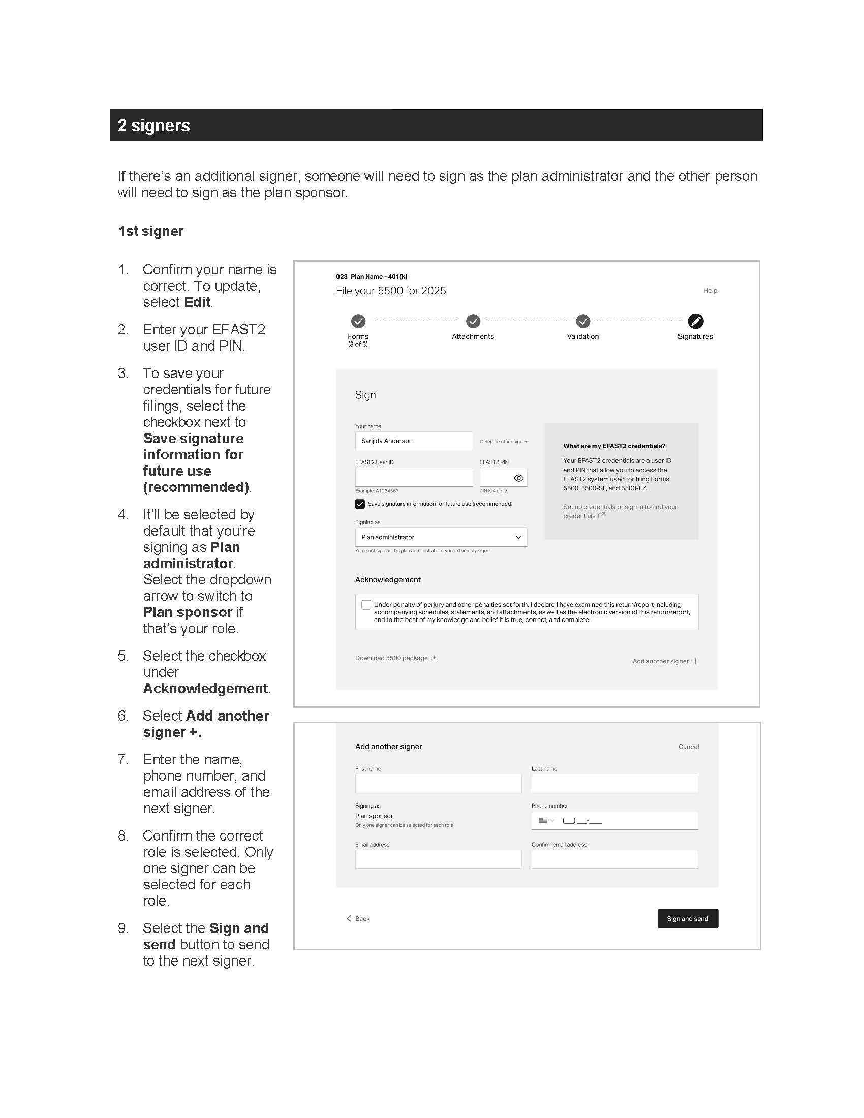
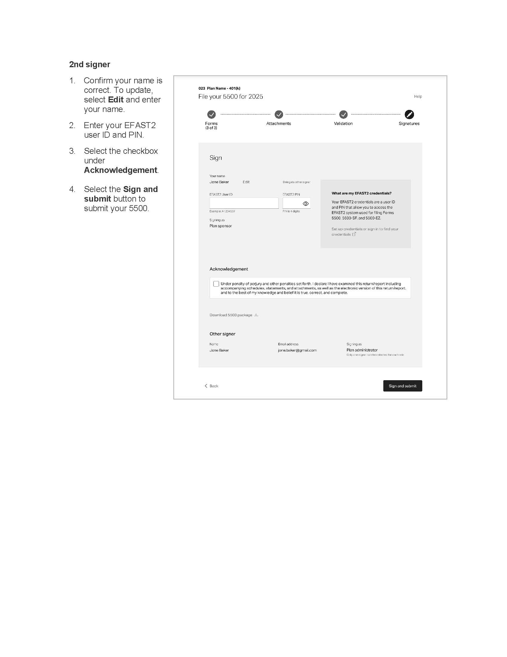
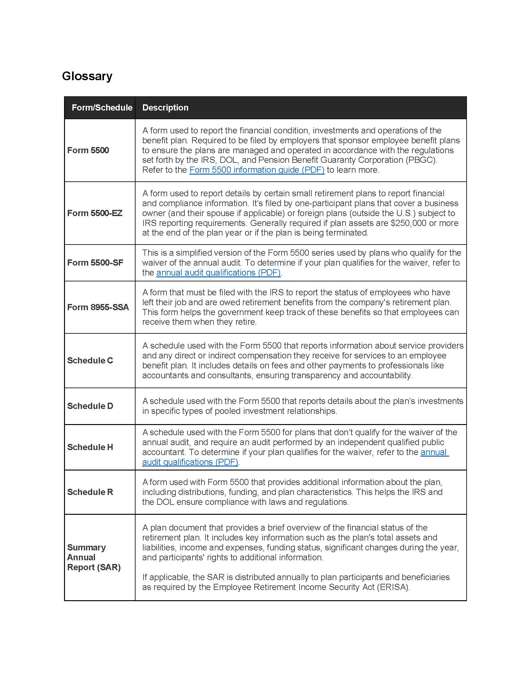
I crafted a PDF guide to help users navigate filing their 5500 forms with EFileEasy. A retsupport link was also created and is linked to on the help modal within the EFileEasy expderience.

credits
Team & tool acknowledgements
in collaboration with Ascensus
UX writing by Meg Morris
UX design by Bethany Schramm
screen mockups designed in FIGMA
copy docs & user guide created in Microsoft Word
development by Ryan Chenkie


beyond the scope
Learnings & looking ahead
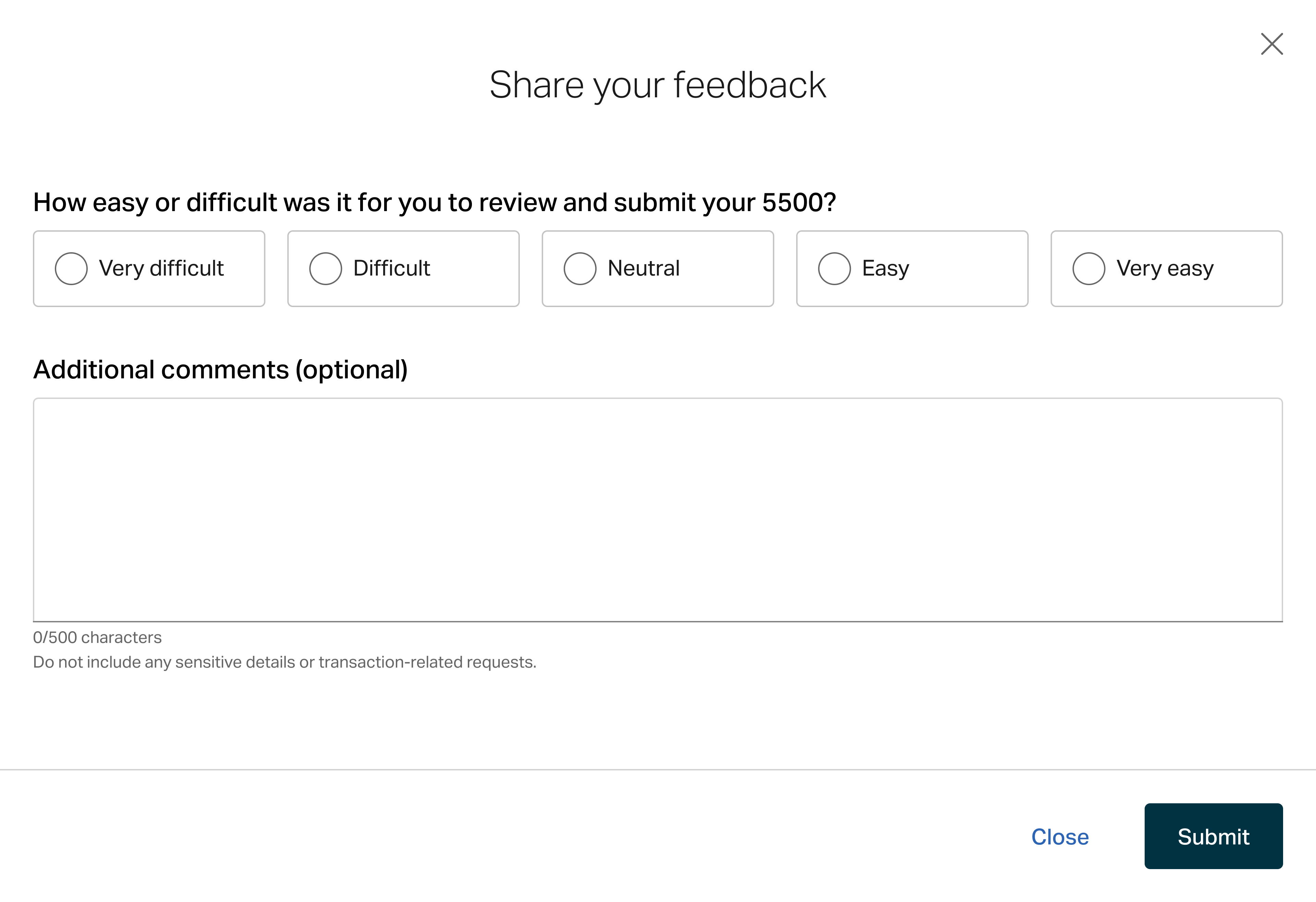
To get a pulse on clients’ feelings on the new experience, users will be prompted with a feedback modal once they submitted their forms. We’ll average their responses, on a scale of 1 (very difficult) to 5 (very easy), to generate a client effort score. We’ll also reviewed the comments to assess what’s working & identify areas for improvement.
Here’s a recap of a few things we noted for future exploration:
- Form edit request/capabilities
- Usability testing for uploading attachments & validation step
(+ more to come once we review user feedback)
Note: Prioritization of these will be based on user feedback, overall impact, &, of course, shifting business objectives.


Let’s connect


5500 filing flow for 401(k) plan sponsors
I collaborated on a navigable UI strategy & wrote UX copy to guide users through filing their 5500 online.
strategy
strategy
dynamic content
UX writing
error messages
help content
challenge
Moving to single sign-on
The previous filing software (Relius) required management of a username & password. This was a struggle for plan sponsors to remember since they only need it once a year.
The proposed solution was to create a new filing experience that could be accessed through single sign-on from the plan sponsor website & tie in with the new compliance landing page.
before & after
From instructions-required headache to straightforward, intuitive steps
I collaborated with the UX designer & developer on a new vision for the filing flow. Since it was all new, we were able to make some changes to improve the user experience as well, removing the dense blocks of text in favor of clear, actionable steps & a defined content heirarchy.
Before: Relius filing
The old UI featured dense block of text, multipe/confusing
After: EFileEasy
We opted for a more minimalist approach with clear calls to action to guide users through the experience.
Some key overarching updates I advocated for that made it to the final launch:
- Less text to read which is less of a cognitive load on users, making it easier for them to focus on each action.
- Removing the e-file step & in favor of having sign/submit be the final step (requiring action & in the progress bar) & having a separate confirmation screen (not shown in the progress bar, because there’s no more progress to complete).
- Patterns for labels, headers, & button CTA text
flow
A step-by-step experience that adopts to plan type & signature choices
We thought through how the experience would change depending on if the user had a small or large ERISA plan, whether it was a plan type that required additional attachments, or if the user wanted to delegate signing or add an additional signer.
There was also a need to create a unique experience for large plans with 3(16) services since they would need to download documents for their audit & upload their accountant’s opinion (but we would still file for them).
forms
Toggle between summary & form view to review information
Users will be prompted to review each prefilled form for their plan. The summary view is selected by default, but they can toggle to the form view to see all of the form fields. Sadly, form edit capabiliteis weren’t
Headers
I styled the headers (H2) as calls to action to guide the user on what action was needed at each step.
Step labels
I had drafted more specific language to accomodate
Summary
The introduction of a summary view meant we needed content to summarize what was documented in the form. I crafted messaging for every possible election.
A sample from the copy deck
H2: Review Form 5500
We’ve prepared your form. If changes are needed, contact your client services team.
Text button: Download 5500 package {download icon}
Tab 1: Summary
Tab 2: Form
H3: Annual report identification information
Label: Plan start date
[MM/DD/YYYY]
Label: Plan end date
[MM/DD/YYYY]
Label: This return/report is for
a multiemployer plan or a single-employer plan or a multiple employer plan or a DFE
Label: This return/report is
the first return/report or the final return/report or an amended return/report or a short plan return/report (less than 12 months)
Label: Filing under
Form 5558 or automatic extension or DFVC program or special extension
This is a retroactively adopted plan permitted by SECURE Act section 201
attachments
Dynamic content for adding required attachments
If the user has a large plan, they’re prompted to attach any required files.
Attach files
I provided content for all of the potential attachments that users could need to upload, so we can dynamically showcase the specific files needed for each users’ plan.
Upload button
The addition of an upload button/step was pushed for by the UX design team to prevent users from losing upload progress if they lost connection or power, etc. I admitadly have concerns about the extra clicks & the potential for
A sample from the copy deck
H2: Attach files
H3: Accountant’s opinion
Body copy: Required for large ERISA plans
Form field label: File upload
Button: Choose file
Button: Upload
Error text: The file is password protected. Remove password protection from the file and upload.
Helper text:
Acceptable format: PDF
Maximum file size: 4MB
Password protected files not accepted.
validation
Reassurance or chance to review issues
The previous filing software (Relius) required the management of a username & password. This was a struggle for plan sponsors to remember since they only need it once a year.
Extra step
We decided to include this step based on user feedback, but the UX designer & I both expressed concerned & curiousity about
Review issues
Error messages tied to potential issues with the forms will appear here. Users will have to contact service for help to address them. We pitched a future state update to allow for them to request or make updates, but that wasn’t in scope for launch.
A sample from the copy deck
H2: Review issues
{✓ icon}
No issues found
OR
{⚠️ icon}
[#] issues found
Review and contact your client services team if you need help.
[error messages]
Text button: Download 5500 package {download icon}
{<icon} Text button: Back
Button: Continue
signatures
Sign with EFAST2 credentials
Users are prompted to sign with thier
Clear, conversational field labels
I used “you” & “your” to refer to the filer/signer to make it feel more conversational & also makes things clear (i.e., “your name” vs. “sponsor name” since some signers may not identify with that role)
Explaining credentials
I wanted to give users context around what these credentials are & where they can set up or locate them if needed since past feedback indicated users struggle to identify & understand the need for additional credentials.
2nd signer info
Selecting the Add another signer + text button, prompts some additional form fields.
Button CTA language
When the user opts to add a 2nd signer, the CTA changes to “send” instead of “submit.” The forms aren’t “submitted” to the IRS/DOL until the other signature is added.
A sample from the copy deck
H2: Sign
Form field label: Your name
Text button: Delegate other signer
Form field label: EFAST2 user ID
Helper text: TBD
Form field label: EFAST2 PIN
Helper text: TBD
{checkbox} Save signature information for future use (recommended)
Form field label: Signing as
Helper text: You must sign as the plan administrator if you’re the only signer.
H3: What are my EFAST2 credentials?
Your EFAST2 credentials are a user ID and PIN that allow you to access the EFAST2 system used for filing Forms 5500, 5500-SF, and 5500-EZ.
Text button: Set up credentials or sign in to find your credentials {external link icon}?
H3: Acknowledgement
{checkbox} Under penalty of perjury and other penalties set forth, I declare I have examined this return/report including accompanying schedules, statements, and attachments, as well as the electronic version of this return/report, and the best of my knowledge and belief it is true, correct, and complete.
Text button: Download 5500 package {download icon}
Text button: Add another signer +
confirmation
A celebration with important details
I pitched the idea of having a confirmation page that was seperate from teh
A bit of joy
We included a celebratory illustration to mark the finish line.
Downloads
We styled the downloads as buttons to give them a bit of weight to draw more attention in case users need or want to save them for their records.
Print confirmation
We styled the print option as a text button so it wouldn’t compete too much with the file downloads. Users will also recieve an email confirmation & be able to reference this page from the compliance landing page
A sample from the copy deck
Text button: Print {🖨️ icon}
{illustration}
H2: Your files have been submitted
H3: Your 5500 has been submitted to the Department of Labor (DOL)
The DOL has received your documents and provided the following confirmation information:
Acknowledgement ID: [#]
Intake date: [date]
H3: Your 8955-SSA has been submitted to the Internal Revenue Service (IRS)
The IRS has received your documents and provided the following confirmation information:
Intake date: [date]
H3: Your 5500 has been submitted to the Department of Labor (DOL)
The DOL has recieved your documents and provided the following confirmation information:
Acknowledgement ID: [#]
Intake date: [date]
Button: Download 5500 package {download icon}
Delegate signer & additional signer added confirmations
I wrote custom confirmation messaging for users who delegated signing or added a 2nd signer. The text for buttons on the cancel confirmation was a little tricky because I didn’t want to use “cancel” to indicate canceling out of an attempt to cancel something. I feel like the question header couples nicely with the “yes” and “no” options plus the brief action statement adds addtional clarity.
The text for buttons on the cancel confirmations was a little tricky because I didn’t want to use “cancel” to indicate canceling out of an attempt to cancel something. I feel like the question header couples nicely with the “yes” and “no” options plus the brief action statement adds additional clarity.
user guide
A guide to online filing
I crafted a PDF guide to help users navigate filing their 5500 forms with EFileEasy. A retsupport link was also created and is linked to on the help modal within the EFileEasy expderience.
credits
Team & tool acknowledgements
in collaboration with Ascensus
UX writing by Meg Morris
UX design by Bethany Schramm
screen mockups designed in FIGMA
copy docs & user guide created in Microsoft Word
development by Ryan Chenkie
beyond the scope
Learnings & looking ahead
To get a pulse on clients’ feelings on the new experience, users will be prompted with a feedback modal once they submitted their forms. We’ll average their responses, on a scale of 1 (very difficult) to 5 (very easy), to generate a client effort score. We’ll also reviewed the comments to assess what’s working & identify areas for improvement.
Here’s a recap of a few things we noted for future exploration:
- Form edit request/capabilities
- Usability testing for uploading attachments & validation step
(+ more to come once we review user feedback)
Note: Prioritization of these will be based on user feedback, overall impact, &, of course, shifting business objectives.
Let’s connect

5500 filing flow for 401(k) plan sponsors
I collaborated on a navigable UI strategy & wrote UX copy to guide users through filing their 5500 online.
online portal
strategy
dynamic content
UX writing
error messages
help content
challenge
Moving to single sign-on
The previous filing software (Relius) required management of a username & password. This was a struggle for plan sponsors to remember since they only need it once a year.
The proposed solution was to create a new filing experience that could be accessed through single sign-on from the plan sponsor website & tie in with the new compliance landing page.
before & after
From instructions-required headache to straightforward, intuitive steps
I collaborated with the UX designer & developer on a new vision for the filing flow. Since it was new, we weren’t locked in to any of the old UI.
Before: Relius filing
The old UI featured dense block of text, multiple & unclear CTAs on screens, and an inconsistent use of interactive elements (for instance to view documents you have to select the text button in one place vs right below that you have to select the checkbox & then select the button). The screens also include instructions to clarify what the user needs to do.
After: EFileEasy
We opted for a more minimalist approach with clear calls to action to guide users through the experience.
Some key overarching updates I advocated for that made it to the final launch:
- Less text to read which is less of a cognitive load on users, making it easier for them to focus on each action.
- Removing the e-file step & in favor of having sign/submit be the final step (requiring action & in the progress bar) & having a separate confirmation screen (not shown in the progress bar, because there’s no more progress to complete).
- Patterns for labels, headers, & button CTA text
user flow
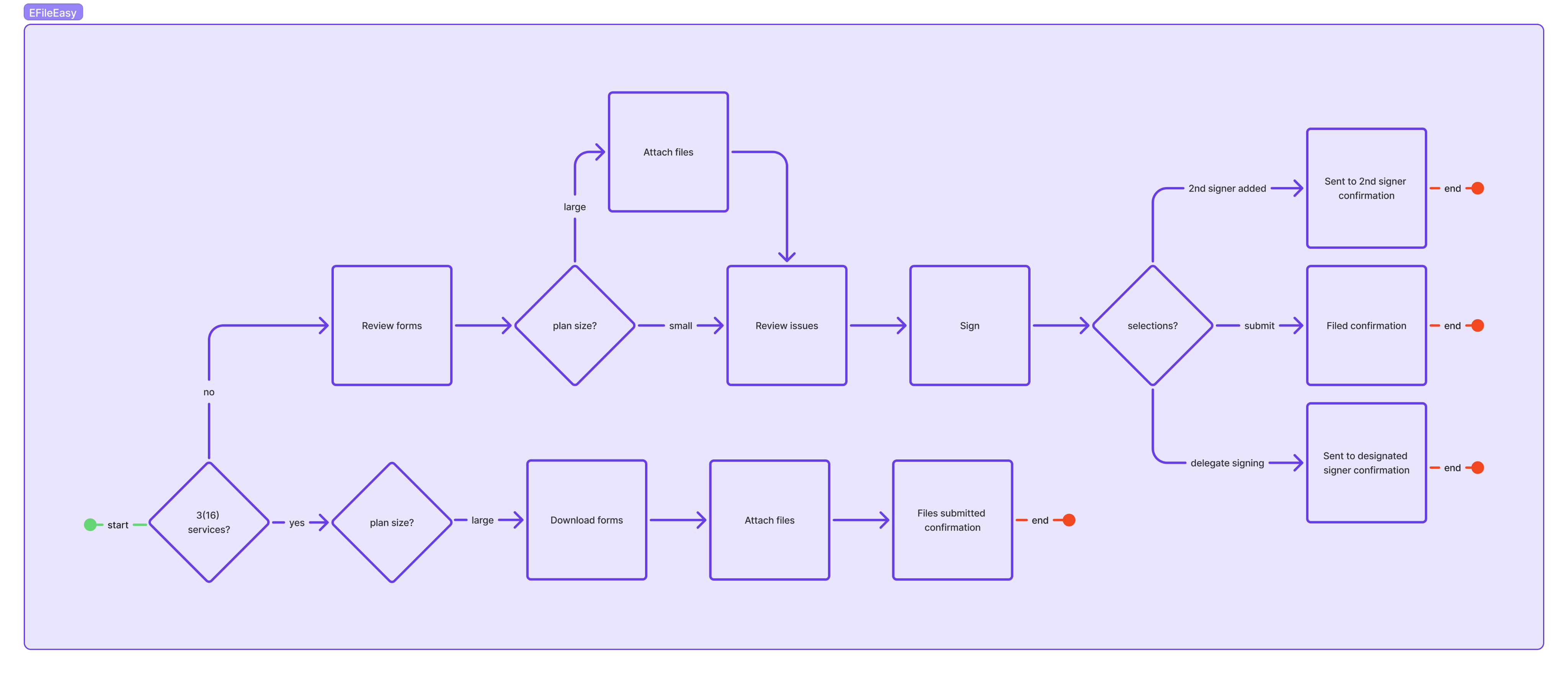
A step-by-step experience that adopts to plan type & signature choices
We thought through how the experience would change depending on if the user had a small or large ERISA plan, whether it was a plan type that required additional attachments, or if the user wanted to delegate signing or add an additional signer.
There was also a need to create a unique experience for large plans with 3(16) services since they would need to download documents for their audit & upload their accountant’s opinion (but we would still file for them).
forms
Toggle between summary & form view to review information
Users are prompted to review each prefilled form. The summary view is selected by default, and they can toggle to the form view. The UX designer & I advocated for the introduction of a request edits feature, but that wasn’t in scope for this round, so users would have to contact client services team if anything is inaccurate.
Headers
I styled the headers (H2) as calls to action to guide the user on what action was needed at each step.
Step labels
I went with one word nouns as the pattern for the step labels—which fit nicely side-by-side within the progress bar.
Summary
The introduction of a summary view meant we needed content to summarize what was documented in the form. I crafted messaging for every possible election.
A sample from the copy deck
H2: Review Form 5500
We’ve prepared your form. If changes are needed, contact your client services team.
Text button: Download 5500 package {download icon}
Tab 1: Summary
Tab 2: Form
H3: Annual report identification information
Label: Plan start date
[MM/DD/YYYY]
Label: Plan end date
[MM/DD/YYYY]
Label: This return/report is for
a multiemployer plan or a single-employer plan or a multiple employer plan or a DFE
Label: This return/report is
the first return/report or the final return/report or an amended return/report or a short plan return/report (less than 12 months)
Label: Filing under
Form 5558 or automatic extension or DFVC program or special extension
This is a retroactively adopted plan permitted by SECURE Act section 201
attachments
Dynamic content for adding required attachments
If the user has a large plan, they’re prompted to attach any required files.
Attach files
I provided content for all of the potential attachments that users could need to upload, so we can dynamically showcase the specific files needed for each users’ plan.
Upload button
The addition of an upload button/step was pushed for in design review to prevent users from losing upload progress if they lost connection or power, closed out, etc. I noted the extra clicks, the potential for it to be overlooked, & the need for additional error messaging as something to validate/address in future usability testing.
A sample from the copy deck
H2: Attach files
H3: Accountant’s opinion
Body copy: Required for large ERISA plans
Form field label: File upload
Button: Choose file
Button: Upload
Error text: The file is password protected. Remove password protection from the file and upload.
Helper text:
Acceptable format: PDF
Maximum file size: 4MB
Password protected files not accepted.
validation
Reassurance or chance to review issues
In usability testing, users expressed an appreciate of having the additional confirmation that there were no issues before they file, so we included this step in the flow as well (even though in most cases, no action is needed).
Extra step
We decided to include this step based on user feedback, but the UX designer & I both expressed concern & curiosity about users understanding of what’s being validated here & whether this is helpful.
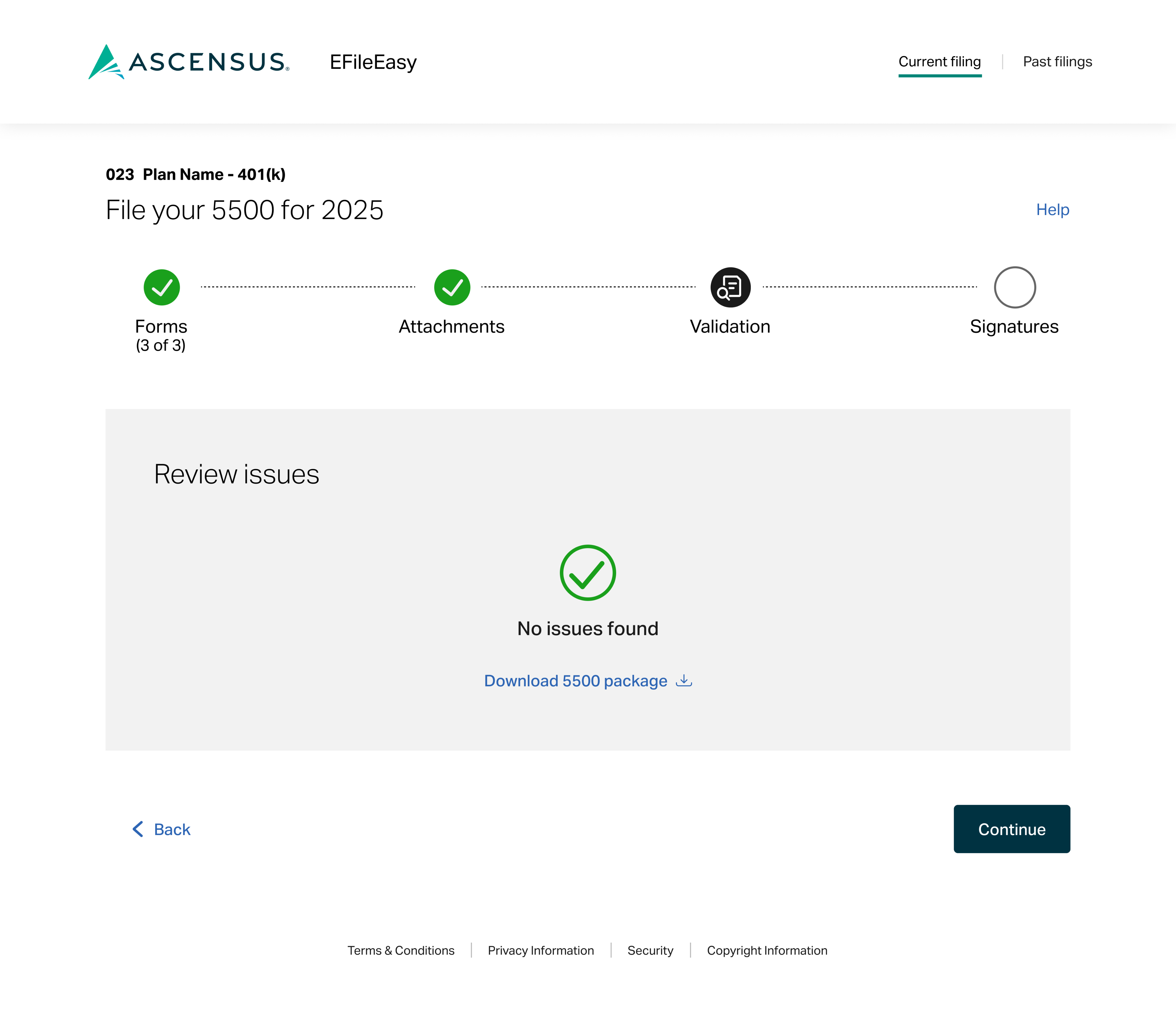
Review issues
Error messages tied to potential issues with the forms will appear here. Users will have to contact service for help to address them. We pitched a future state update to allow for them to request or make updates, but that wasn’t in scope for launch.
A sample from the copy deck
H2: Review issues
{✓ icon}
No issues found
OR
{⚠️ icon}
[#] issues found
Review and contact your client services team if you need help.
[error messages]
Text button: Download 5500 package {download icon}
{<icon} Text button: Back
Button: Continue
signatures
Sign with EFAST2 credentials
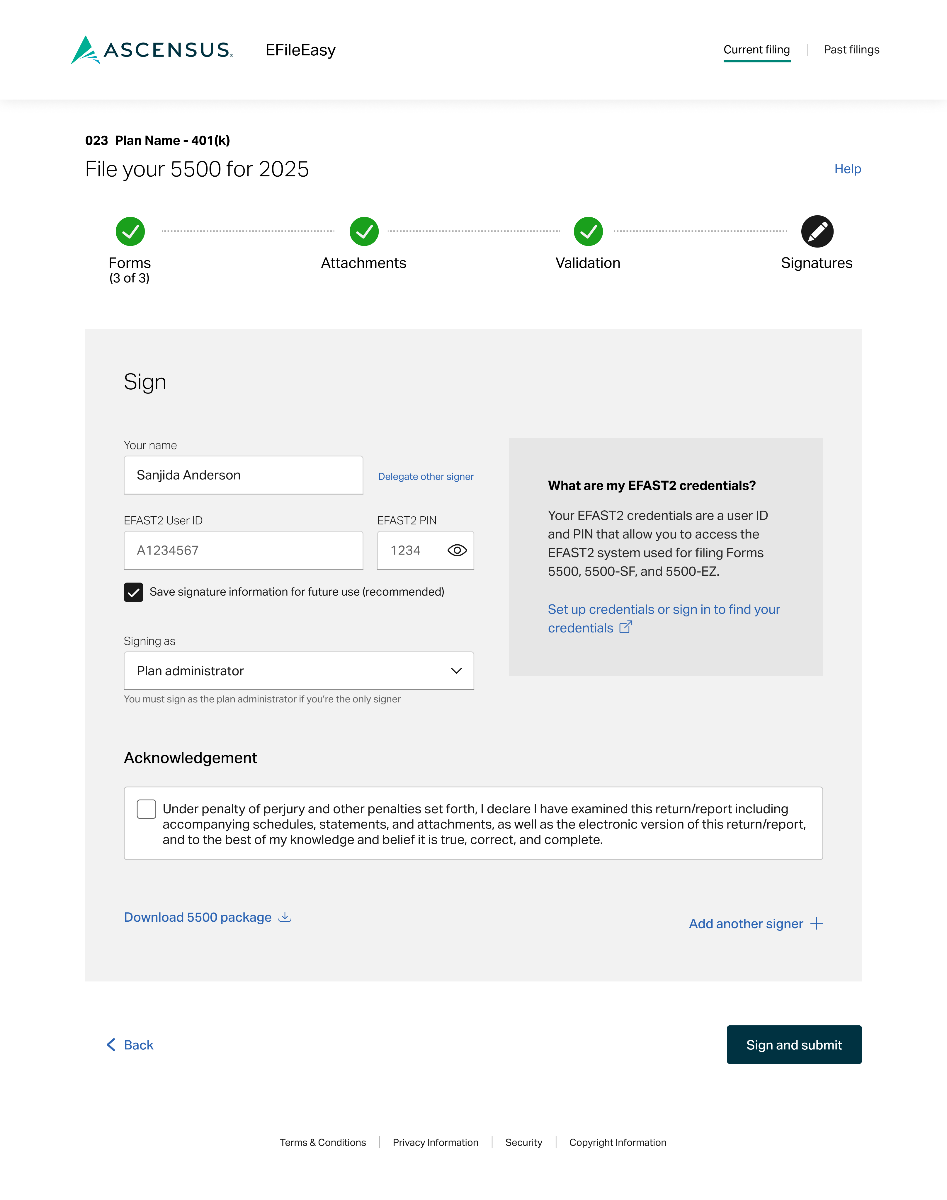
Users are prompted to sign with their EFAST2 credentials. They can also choose to delegate signing or add an additional signer from this screen.
Clear, conversational field labels
I used “you” & “your” to refer to the filer/signer to make it feel more conversational & also makes things clear (i.e., “your name” vs. “sponsor name” since some signers may not identify with that role)
Explaining credentials
I wanted to give users context around what these credentials are & where they can set up or locate them if needed since past feedback indicated users struggle to identify & understand the need for additional credentials.
2nd signer info
Selecting the Add another signer + text button, prompts some additional form fields.
Button CTA language
When the user opts to add a 2nd signer, the CTA changes to “send” instead of “submit.” The forms aren’t “submitted” to the IRS/DOL until the other signature is added.
A sample from the copy deck
H2: Sign
Form field label: Your name
Text button: Delegate other signer
Form field label: EFAST2 user ID
Helper text: TBD
Form field label: EFAST2 PIN
Helper text: TBD
{checkbox} Save signature information for future use (recommended)
Form field label: Signing as
Helper text: You must sign as the plan administrator if you’re the only signer.
H3: What are my EFAST2 credentials?
Your EFAST2 credentials are a user ID and PIN that allow you to access the EFAST2 system used for filing Forms 5500, 5500-SF, and 5500-EZ.
Text button: Set up credentials or sign in to find your credentials {external link icon}?
H3: Acknowledgement
{checkbox} Under penalty of perjury and other penalties set forth, I declare I have examined this return/report including accompanying schedules, statements, and attachments, as well as the electronic version of this return/report, and the best of my knowledge and belief it is true, correct, and complete.
Text button: Download 5500 package {download icon}
Text button: Add another signer +
confirmation
A celebration with important details
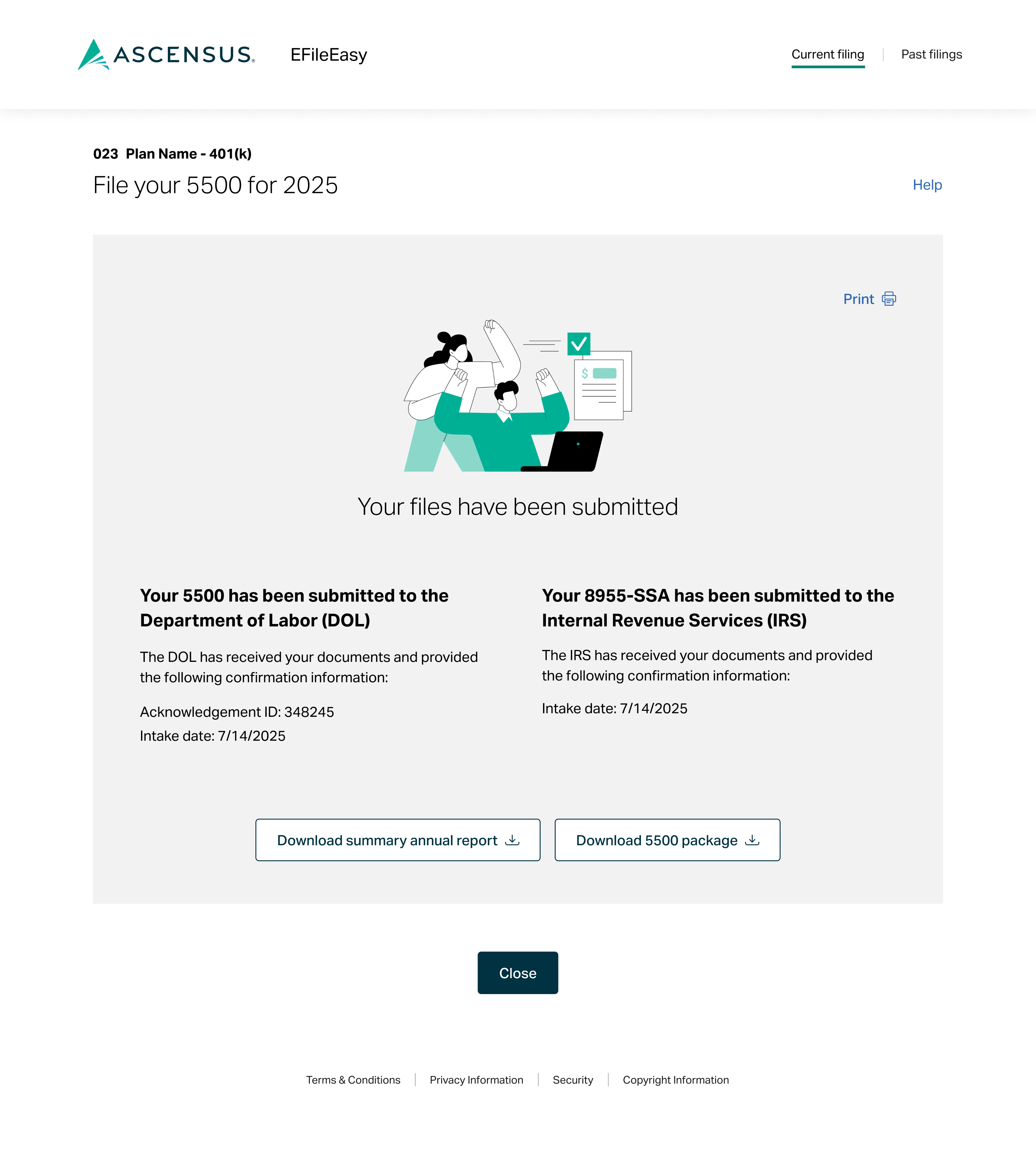
I pitched the idea of having a confirmation page that was separate from the steps (so not called out on the progress bar) & suggested it would be cool to have it feel a bit more celebratory (maybe with a checkmark, confetti optional). The UX designer was on board & confirmed they’d done similar patterns for other flows. She also recommended an illustration (which I love & feels very fitting to filing).
A bit of joy
We included a celebratory illustration to mark the finish line.
Downloads
We styled the downloads as buttons to give them a bit of weight to draw more attention in case users need or want to save them for their records.
Print confirmation
We styled the print option as a text button so it wouldn’t compete too much with the file downloads. Users will also receive an email confirmation & have access to reference this page again from a link on the 5500 filed task on the compliance landing page.
A sample from the copy deck
Text button: Print {🖨️ icon}
{illustration}
H2: Your files have been submitted
H3: Your 5500 has been submitted to the Department of Labor (DOL)
The DOL has received your documents and provided the following confirmation information:
Acknowledgement ID: [#]
Intake date: [date]
H3: Your 8955-SSA has been submitted to the Internal Revenue Service (IRS)
The IRS has received your documents and provided the following confirmation information:
Intake date: [date]
Button: Download summary annual report {download icon}
Button: Download 5500 package {download icon}
Delegate signer & additional signer added confirmations
I wrote custom alternative confirmation messaging for users who delegated signing or added a 2nd signer.
The text for buttons on the cancel confirmations was a little tricky because I didn’t want to use “cancel” to indicate canceling out of an attempt to cancel something. I feel like the question header couples nicely with the “yes” and “no” options plus the brief action statement adds additional clarity.
user guide
A guide to online filing
I crafted a PDF guide to help users navigate filing their 5500 forms with EFileEasy. A retsupport link was also created and is linked to on the help modal within the EFileEasy experience.
credits
Team & tool acknowledgements
in collaboration with Ascensus
UX writing by Meg Morris
UX design by Bethany Schramm
screen mockups designed in FIGMA
copy docs & user guide created in Microsoft Word
development by Ryan Chenkie


beyond the scope
Learnings & looking ahead
To get a pulse on clients’ feelings on the new experience, users will be prompted with a feedback modal once they submitted their forms. We’ll average their responses, on a scale of 1 (very difficult) to 5 (very easy), to generate a client effort score. We’ll also reviewed the comments to assess what’s working & identify areas for improvement.
Here’s a recap of a few things we noted for future exploration:
- Form edit request/capabilities
- Usability testing for uploading attachments & validation step
(+ more to come once we review user feedback)
Note: Prioritization of these will be based on user feedback, overall impact, &, of course, shifting business objectives.
Let’s connect