
Choice flow for retiring credit card
I wrote UX copy & collaborated on a flow to introduce a choice factor to the retiring credit card migration experience for the Wells Fargo app.
banking app
UX strategy
content design
UX writing
product comparison
product choice
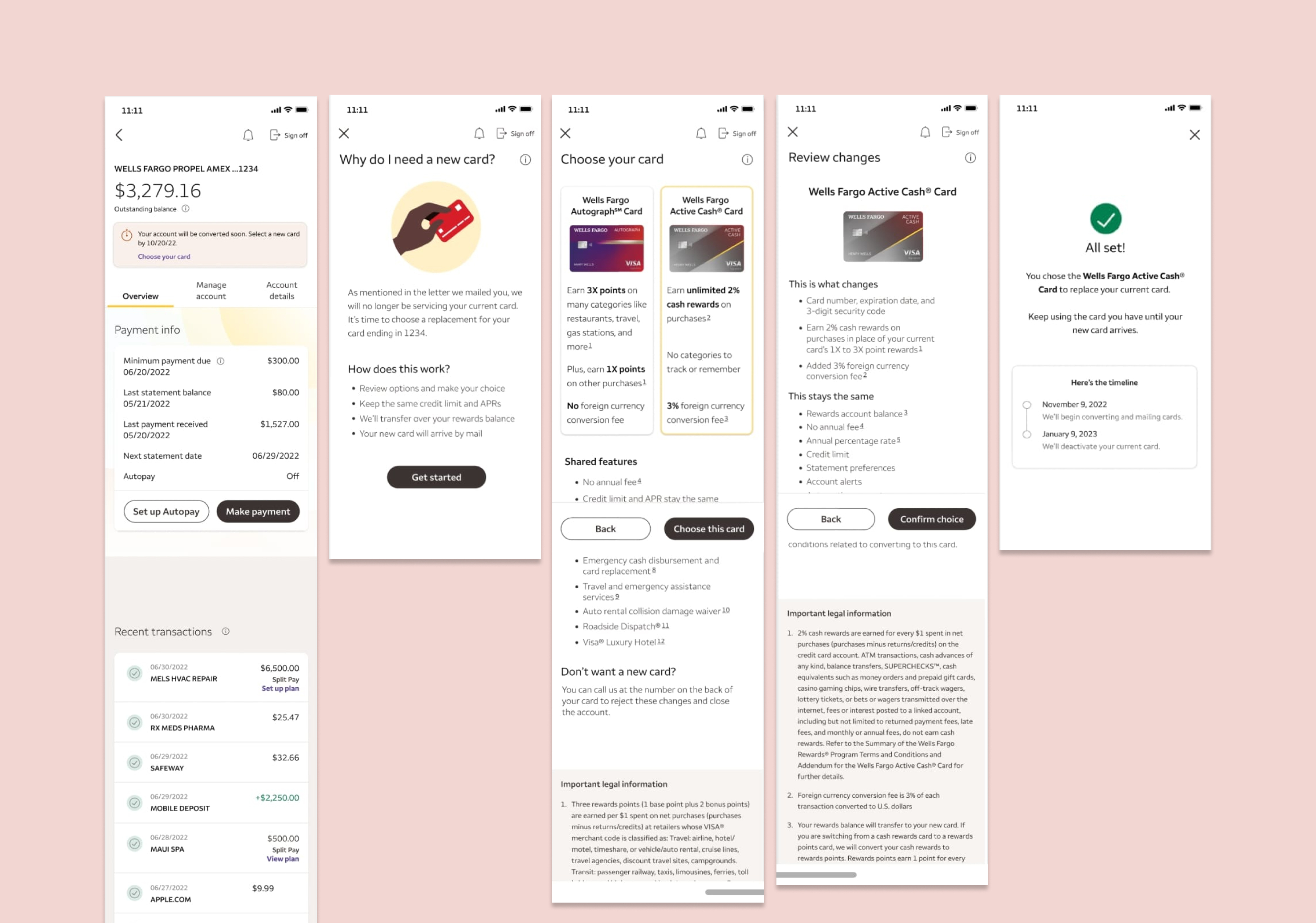
flow
Choose a replacement for your retiring credit card
I strategized with the UX designer on the layout of information & number of screens to ensure we presented the information in a clear, digestible pieces to reduce cognitive overload.
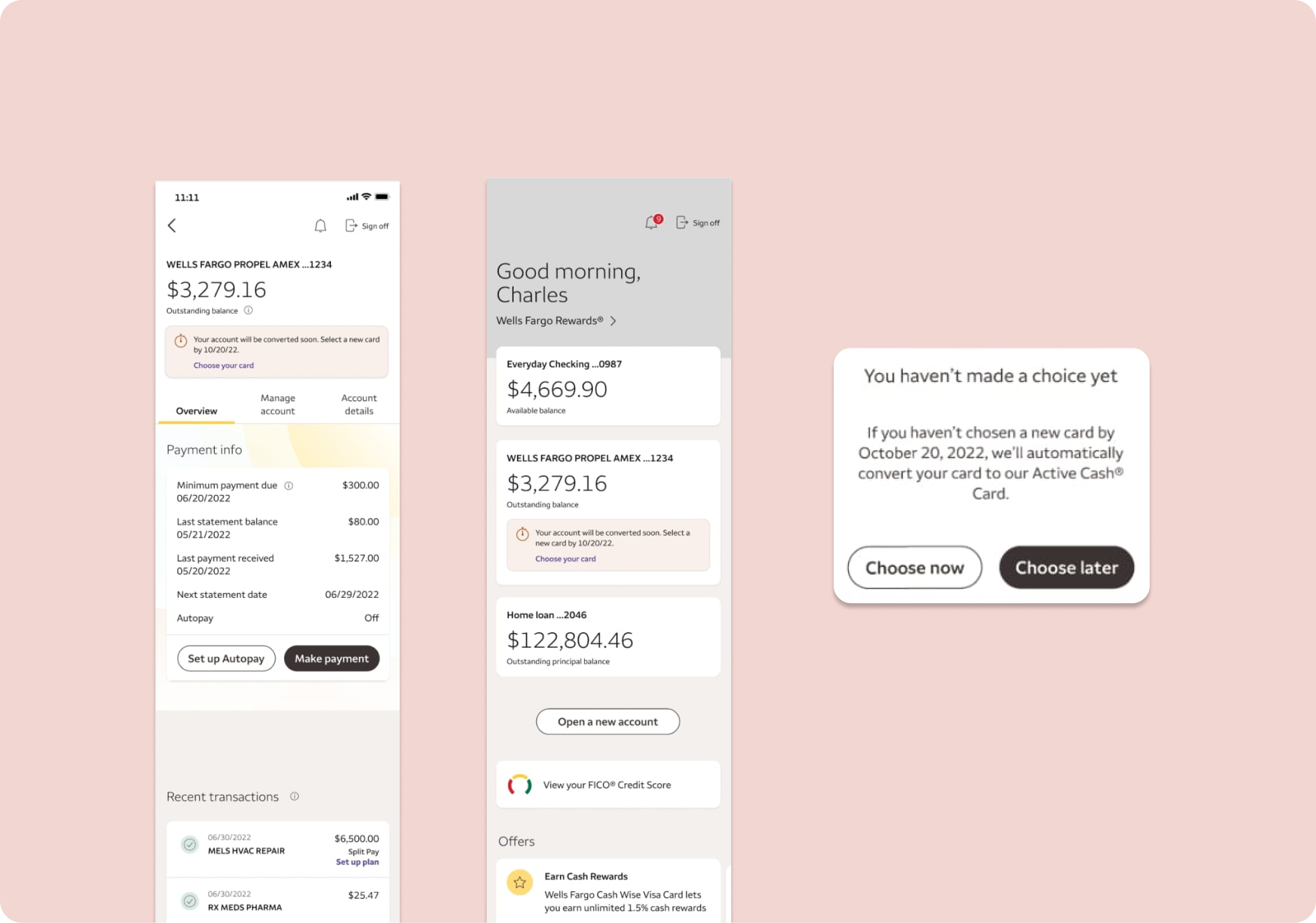
notifications banners & confirmation modal
A deadline to make a choice
The traditional path for credit card migrations was to automatically convert them to a new credit card. We felt that giving users a choice would give users a sense of empowerment & a chance to select the rewards that align with their current lifestyle, but we still had a deadline since their old cards would have a retired date. I wanted to make sure users understood their card would be “converted” - choice or no choice.
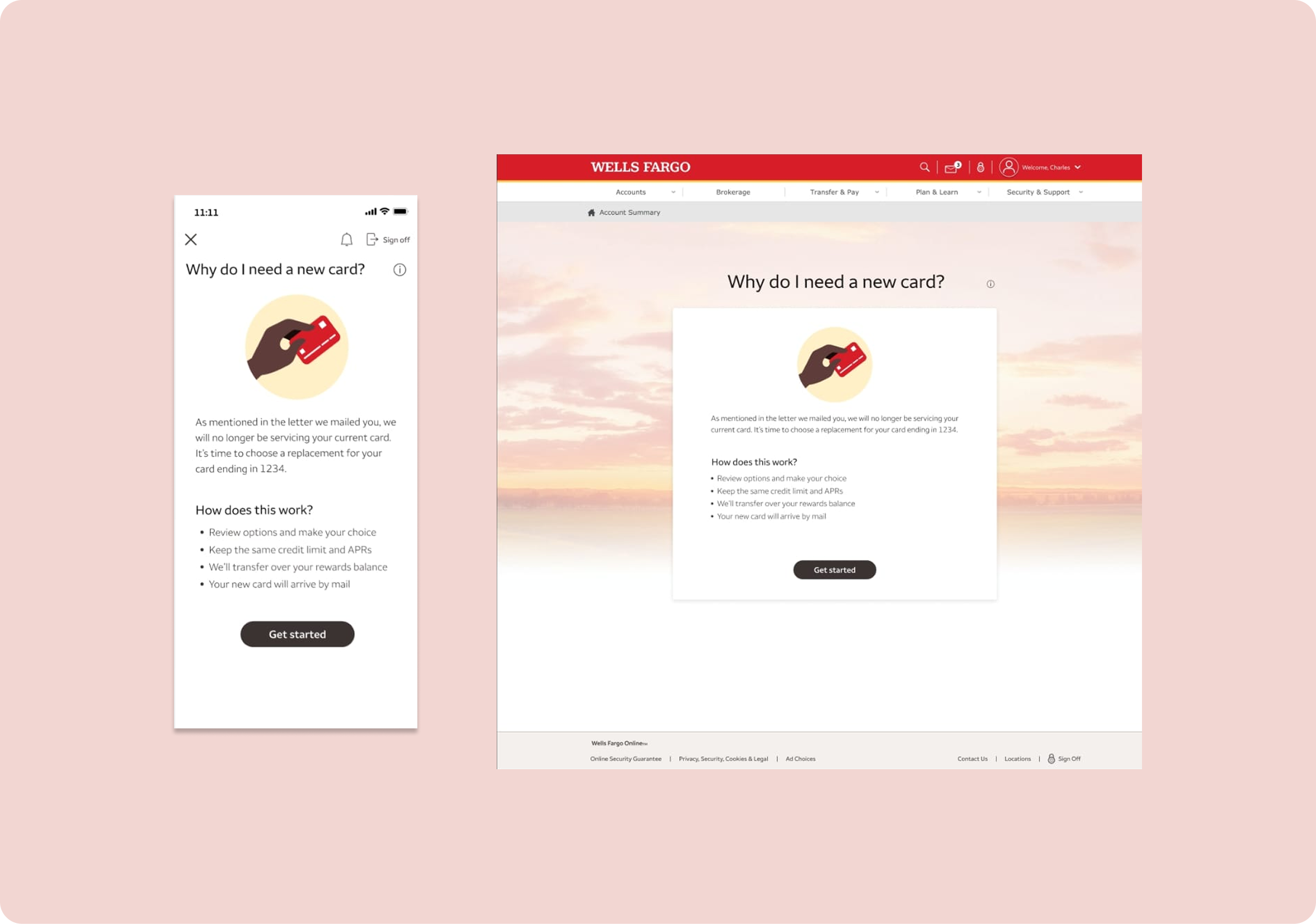
landing page
Some context about what’s happening
I’m not typically one to bring up mailed communications in a digital flow if avoidable, but stakeholders were keen on making sure cardholders knew to reference the information in the letter, which had more of the disclosure-type information about the retirement of the card. I included an overview of what the user can expect based on frequenlty asked questions.
compare & choose
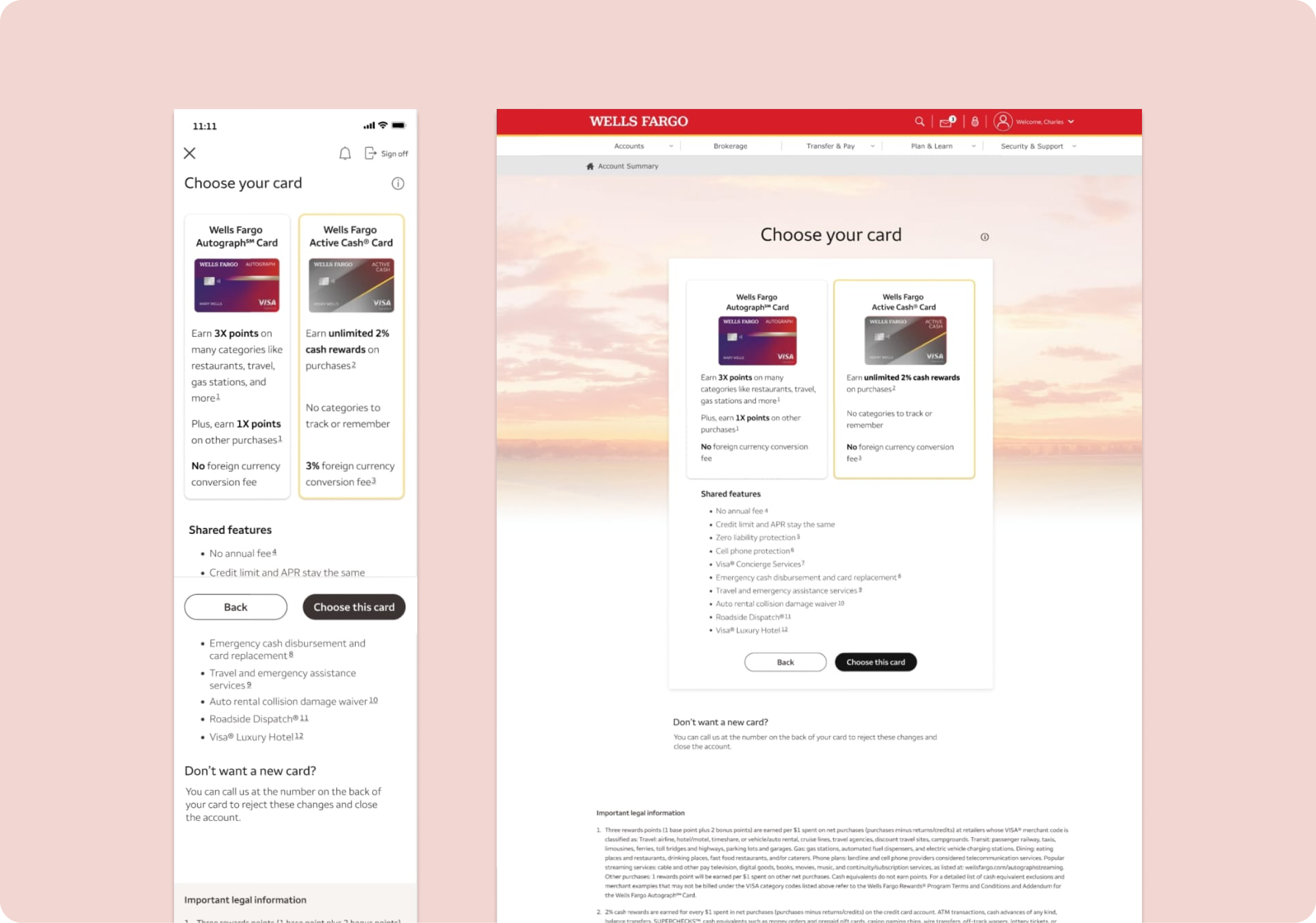
Choose the right card for you
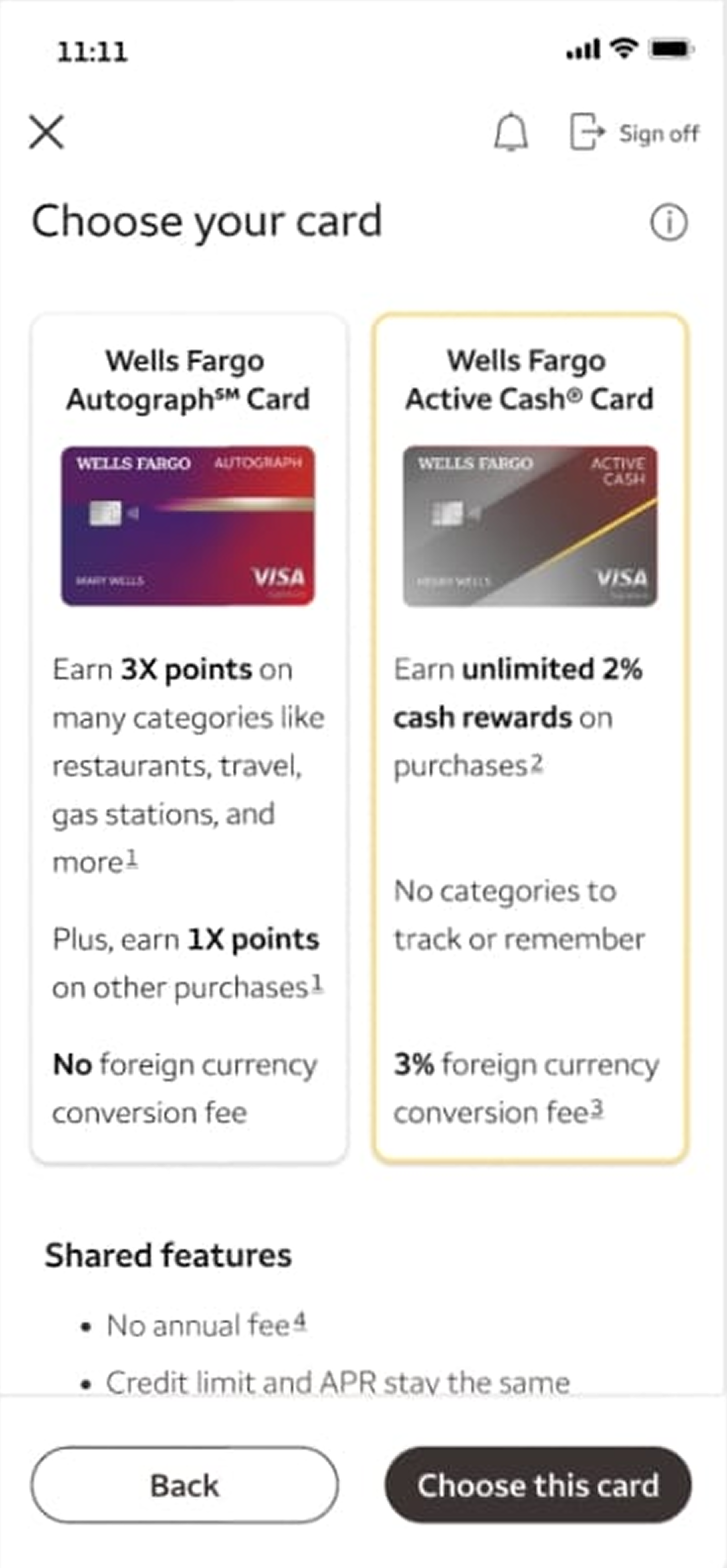
Since the only card options would be the 2 Wells Fargo cards, there are only core differences (rewards accrual type & the inclusion or lack of a foreign currency conversion fee), so we aligned on showing the core card differences as selection cards and shared features below that.
I suggested adding a flow for them to reject the changes & cancel there card, but that was out of scope for this launch. Instead, I included a call out towards the bottoms with instructions for users who want to go that route.
review changes
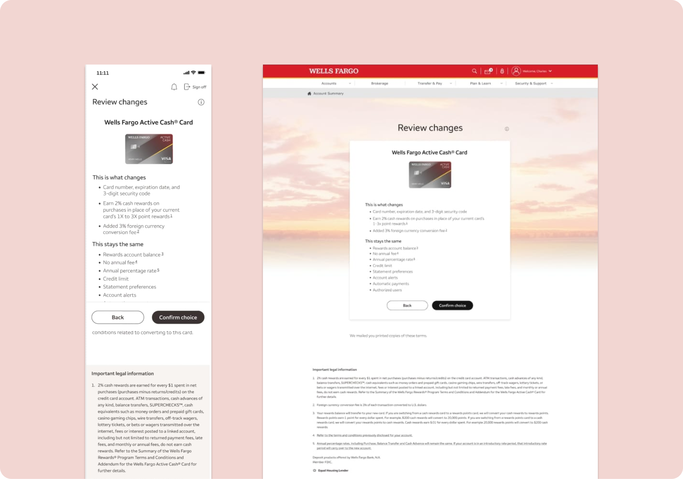
A recap of what will be changing
Instead of cramming what was changing from their current card to the new one in thier selection
confirmation
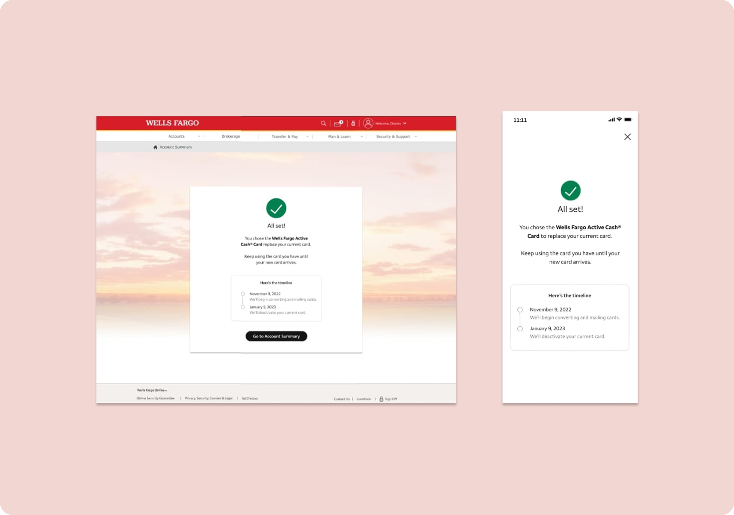
You’re all set & here’s what happens next
In addition to confirming they’re choice, I let the user know to keep using thier card
credits
Team & tool acknowledgements
in collaboration with WELLS FARGO
content design by Meg Morris
UX design by Emmanuel Camarena
designed in FIGMA
copy docs created in Microsoft Word


beyond the scope
Learnings & looking ahead
More specific content for missing data,



Let’s connect


Choice flow for retiring credit card
I wrote UX copy & collaborated on a flow to introduce a choice factor to the retiring credit card migration experience for the Wells Fargo app.
banking app
UX strategy
content design
UX writing
product comparison
product choice
flow
Choose a replacement for your retiring credit card
I strategized with the UX designer on the layout of information & number of screens to ensure we presented the information in a clear, digestible pieces to reduce cognitive overload.
notifications banners & confirmation modal
A deadline to make a choice
The traditional path for credit card migrations was to automatically convert them to a new credit card. We felt that giving users a choice would give users a sense of empowerment & a chance to select the rewards that align with their current lifestyle, but we still had a deadline since their old cards would have a retired date. I wanted to make sure users understood their card would be “converted” - choice or no choice.
landing page
Some context about what’s happening
I’m not typically one to bring up mailed communications in a digital flow if avoidable, but stakeholders were keen on making sure cardholders knew to reference the information in the letter, which had more of the disclosure-type information about the retirement of the card. I included an overview of what the user can expect based on frequenlty asked questions.
compare & choose
Choose the right card for you
Since the only card options would be the 2 Wells Fargo cards, there are only core differences (rewards accrual type & the inclusion or lack of a foreign currency conversion fee), so we aligned on showing the core card differences as selection cards and shared features below that.
I suggested adding a flow for them to reject the changes & cancel there card, but that was out of scope for this launch. Instead, I included a call out towards the bottoms with instructions for users who want to go that route.
review changes
A recap of what will be changing
Instead of cramming what was changing from their current card to the new one in thier selection
confirmation
You’re all set & here’s what happens next
In addition to confirming they’re choice, I let the user know to keep using thier card
credits
Team & tool acknowledgements
in collaboration with WELLS FARGO
content design by Meg Morris
UX design by Emmanuel Camarena
designed in FIGMA
copy docs created in Microsoft Word
beyond the scope
Learnings & looking ahead
More specific content for missing data,
Let’s connect

Choice flow for retiring credit card
I wrote UX copy & collaborated on a flow to introduce a choice factor to the retiring credit card migration experience for the Wells Fargo app.
banking app
UX strategy
content design
UX writing
product comparison
product choice
flow
Choose a replacement for your retiring credit card
I strategized with the UX designer on the layout of information & number of screens to ensure we presented the information in a clear, digestible pieces to reduce cognitive overload.
notifications banners & confirmation modal
A deadline to make a choice
The traditional path for credit card migrations was to automatically convert them to a new credit card. We felt that giving users a choice would give users a sense of empowerment & a chance to select the rewards that align with their current lifestyle, but we still had a deadline since their old cards would have a retired date. I wanted to make sure users understood their card would be “converted” - choice or no choice.
landing page
Some context about what’s happening
I’m not typically one to bring up mailed communications in a digital flow if avoidable, but stakeholders were keen on making sure cardholders knew to reference the information in the letter, which had more of the disclosure-type information about the retirement of the card. I included an overview of what the user can expect based on frequently asked questions.
compare & choose
Choose the right card for you
Since the only card options would be the 2 Wells Fargo cards, there are only core differences (rewards accrual type & the inclusion or lack of a foreign currency conversion fee), so we aligned on showing the core card differences as selection cards and shared features below that.
I suggested adding a flow for them to reject the changes & cancel there card, but that was out of scope for this launch. Instead, I included a call out towards the bottoms with instructions for users who want to go that route.
review changes
A recap of what will be changing
Instead of cramming what was changing from their current card to the new one in their selection options, I recommended breaking it out as a separate screen to reduce cognitive overload. My suspicion is that users either are familiar with their benefits or have no idea what they because they don’t keep up with them. Either way, I felt this would be less of a priority in their selection choice. Users can can still navigate back to the selection screen if it does influence their decision though.
confirmation
You’re all set & here’s what happens next
In addition to confirming they’re choice, I let the user know to keep using their card. Feedback from UX leadership threw out the idea of adding a timeline to the confirmation.
I collaborated with the UX designer on the content & presentation of a new stacked timeline component. Previous iterations were primarily for a desktop experience & were too wide & didn’t fit with our new mobile-1st design strategy.
credits
Team & tool acknowledgements
in collaboration with WELLS FARGO
content design by Meg Morris
UX design by Emmanuel Camarena
designed in FIGMA
copy docs created in Microsoft Word


beyond the scope
Learnings & looking ahead
More specific content for missing data,
Let’s connect